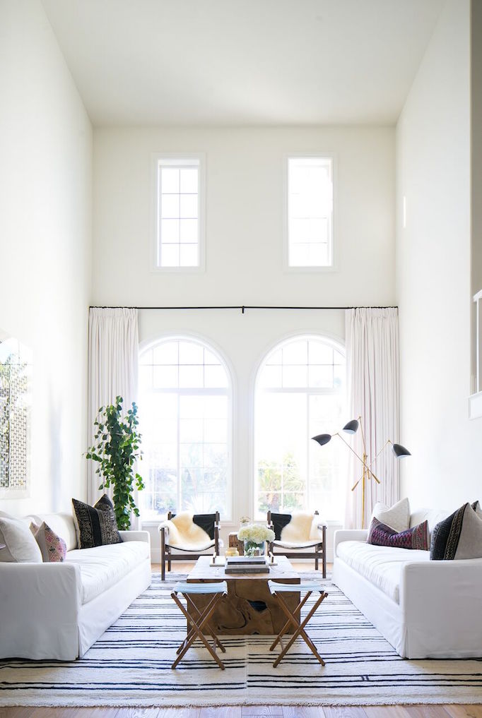
My personal design esthetic definitely leans towards traditional lines with a touch of glam and thoughtful pops of colour. But I must say, there is something beautiful and elegant about a room layered in neutrals like grey and white. They are fresh and crisp, creating a relaxed and comfortable vibe. But without careful intention, it’s easy to slip into ho-hum beige on cream on beige. So I’m sharing three keys to creating a captivating neutral interior.
Texture
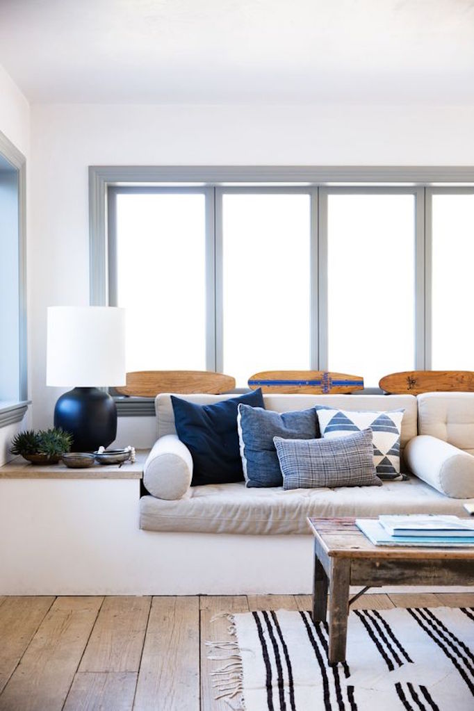
Without colour, texture is the number one way to add interest and depth to a neutral space. Think woven rugs, knit textiles, furs, and rustic or worn woods.
Contrast
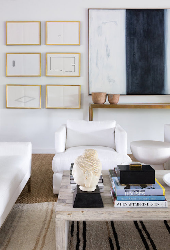
To create that crisp feel, punctuate a neutral space with black (which is also considered to be a neutral), such as a wrought iron table, black accessories, or electronics. The contrast against the other neutral elements creates the depth and elegance we’re after.
Look Up
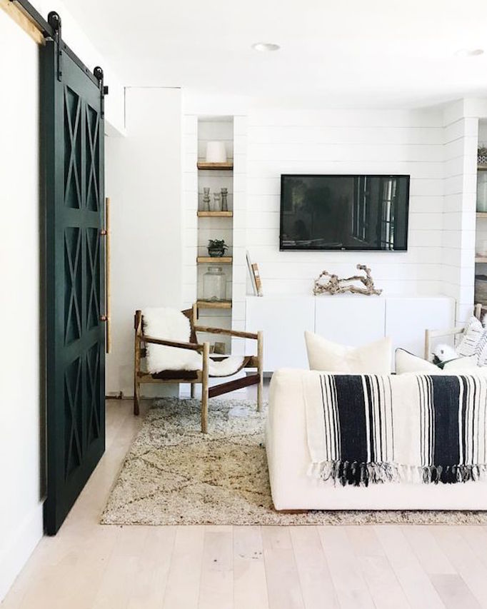
When designing a neutral space, make use of every surface – add interest through lighting, a wall treatment such as shiplap or a tone on tone wallpaper or by highlight a vaulted ceiling with beams.
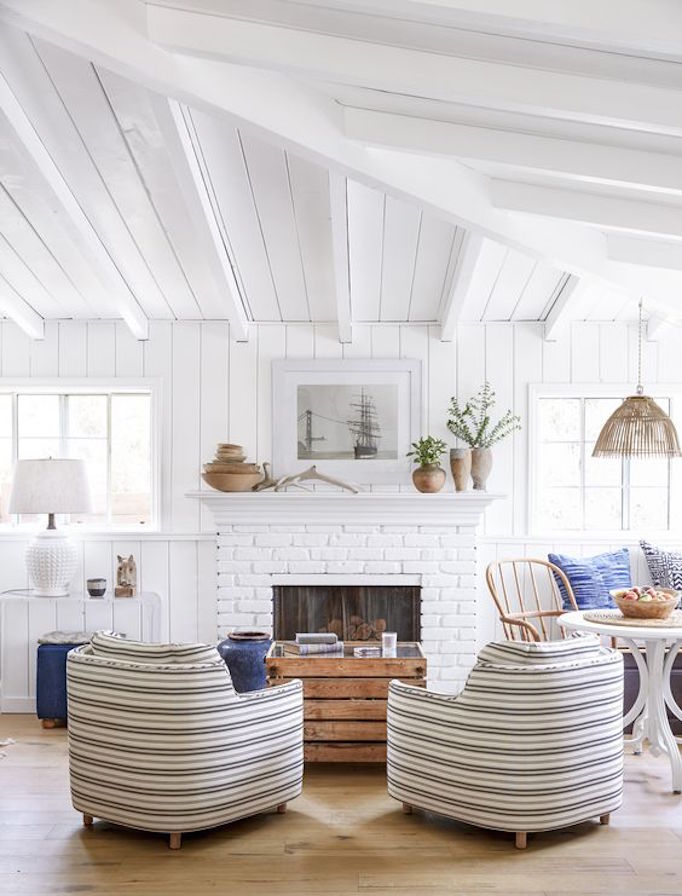
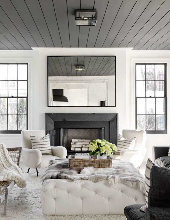
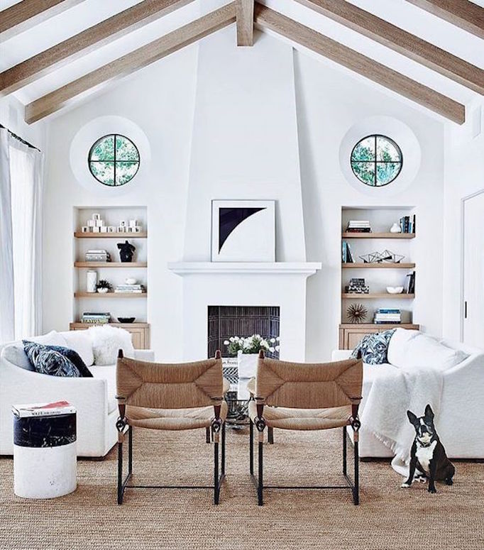
Images

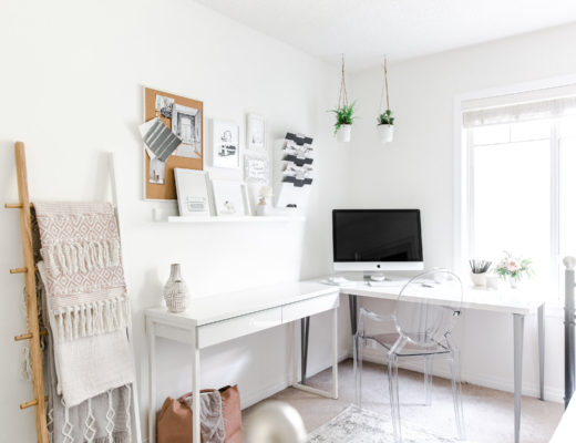
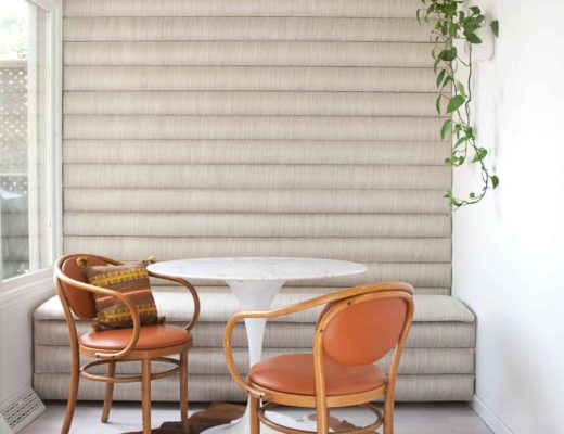

I enjoyed looking at these pictures. Shiplap is always a good go to!
Thank you! It really is and now with great shiplap wallpapers, it’s easier than ever. Thank you for stopping by!
xx
Neelam