I see it with my clients all the time, we change up one area or aspect of their space which then inspires a whole cascade of design and decor changes. I’m not going to lie – I love it! I love it that is, when it’s my client’s space. When the same thing starts to happen in my own space during the busiest time of year, I start to wish I hadn’t begun!
Earlier this summer I had my place painted, which has now inspired a kitchen update. Nothing major, just surfaces – counter-tops, back-splash, painting out the cabinetry and depending on budget, switching out the appliances. Nothing major 😉
Since this is a more substantial update than the painting, I’ve allowed myself to take my time with it. But that hasn’t dampened my incessant collection of kitchen design inspirations. So I thought I would share them here, in case anyone else is looking to update or renovate their kitchen.
The theme for me without question is white, bright, marble and brass!
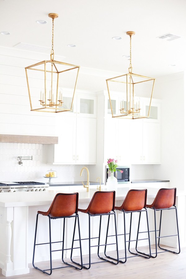 (Design: E. Interiors; Photography: Megan Papworth)
I just love the shiplap range hood. It adds a beautiful rustic element in a very modern space and pairs perfectly with the cobalt blue barn door. Perhaps for my next client project!
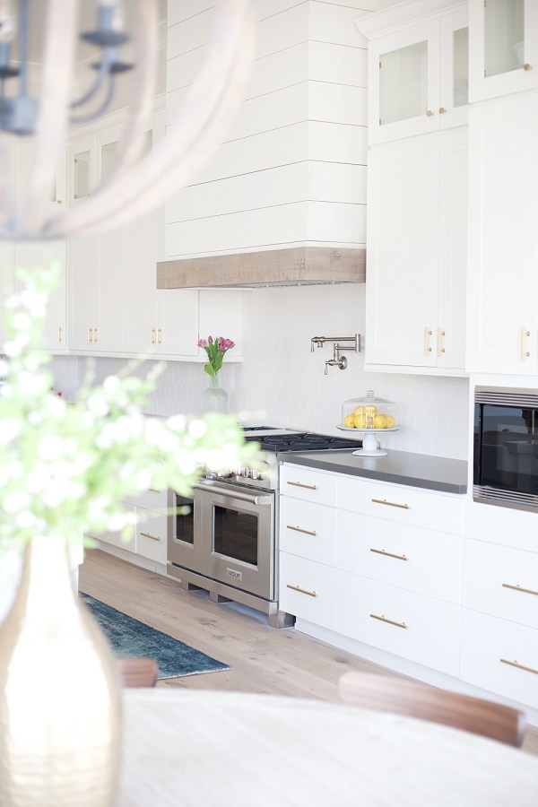 (Design: E. Interiors; Photography: Megan Papworth)
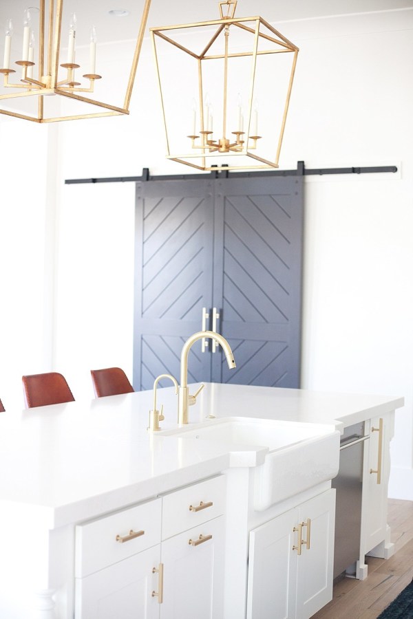 (Design: E. Interiors; Photography: Megan Papworth)
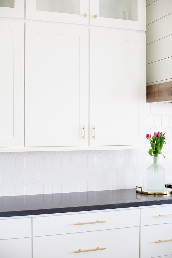 (Design: E. Interiors; Photography: Megan Papworth)
While my heart yearns for brass fixtures, I must say there is something spectacular about matt black fixtures.
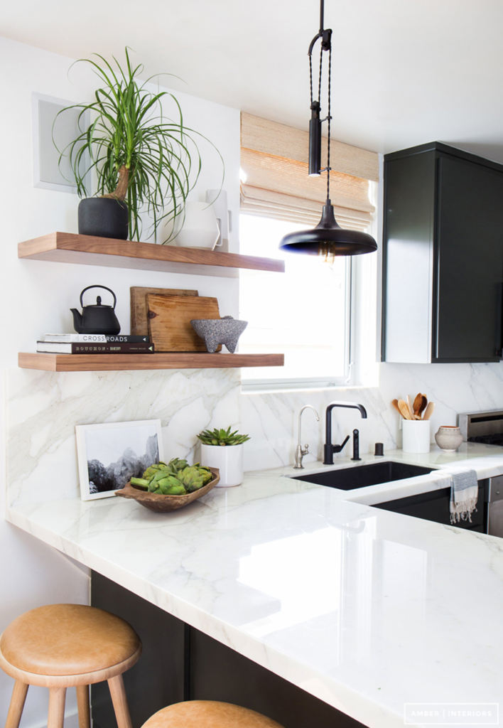 (Design: Amber Interiors; Photography: Tessa Neustadt)
Since my kitchen doesn’t get any natural light (typical condo kitchen), I’m leaning towards white cabinetry, but there is something so charming about gray or dark lowers and light uppers. Decisions, decisions …
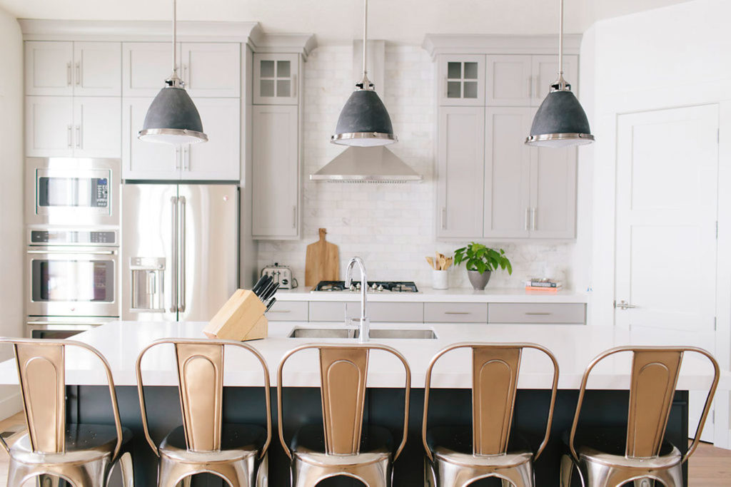 (Design: House of Jade Interiors; Photography: Becky Kimball)
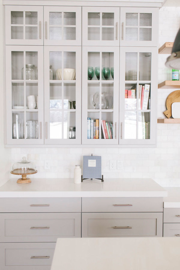 (Design: House of Jade Interiors; Photography: Becky Kimball)
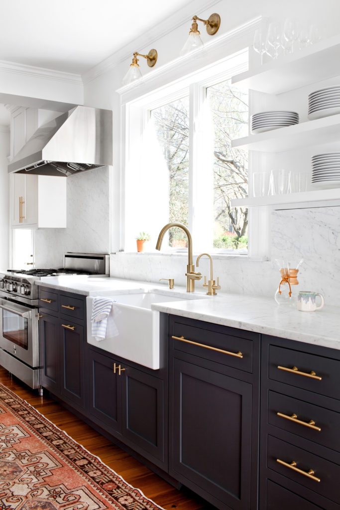 (Design: Elizabeth Lawson Design; Photography: Jennifer Hughes)
While there are tonne of fun options for back splashes, you can see some of them here, not surprisingly I’m leaning towards a white subway tile, simple and classic. Although these white moroccan tiles are amazing and a marble herringbone wouldn’t be so bad 😉
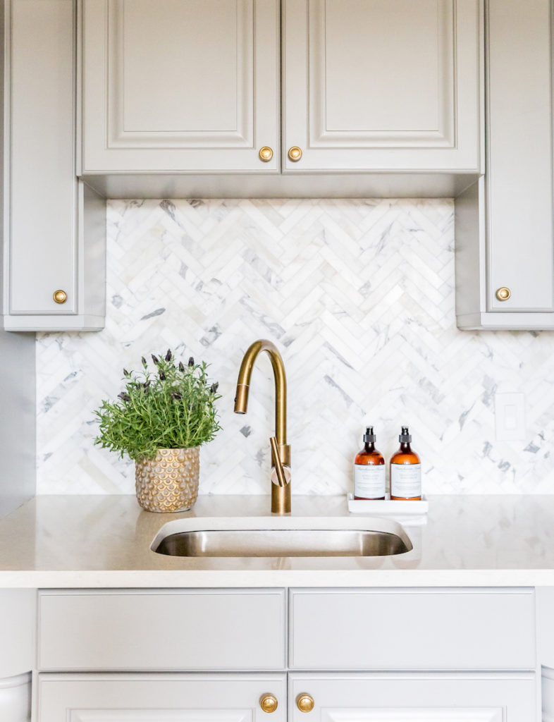 (Design: Studio McGee; Photography: Lindsay Salazar)
What are your favorite kitchen design trends? I’d love to know, feel free to share in the comments below.
Curious, what I’ve decided to go with? Stay tuned, I’m am SO close to finalizing all the details!


Hello Neelam,
Following youf rom Blog Podium 2016. You have such a lovely blog. These kitchens are amazing! I really enjoyed my visit and will be back.
Gabriela
Gabriela! Thank you so much for stopping by and so happy you enjoyed your visit 🙂 Looking forward to visiting your blog!
xx
Neelam