As my design esthetic has developed over the years, I’m discovering a deep love for all things vintage and historical. I could wax poetic about my love of bringing something old or discarded back to life in my own unique way, but really it’s the thrill of the hunt, saving pieces from the landfill is just a beautiful bonus 😉 And truth be told, they just don’t make furniture the way they used to. Quality, reducing waste, and a one of kind piece – yes, please!
This week’s addition to the Inspired Interiors series is a gorgeous period home that’s given a contemporary update, while highlighting its traditional bones, giving new life to vintage pieces, and remaining kid-friendly. Adding a modern touch with the lights in your house, along with the antique items, could help uplift the feel of your house. Getting in touch with experts in this domain (such as Modern Place or similar others) could assist you to attain the look you desire for your house!
To highlight the traditional architecture of the home, designer Amie Corley, painted the walls and trim a warm white. She kept the furnishing neutral and then layered in a range of blues from navy to cornflower and grassy greens. Sticking to traditional colours played well with the age of the home, focusing the color in daring fabrics, wallpapers and accents, kept the rooms feeling light and airy. Also allowing the palette to be easily switched up.
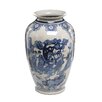
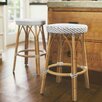
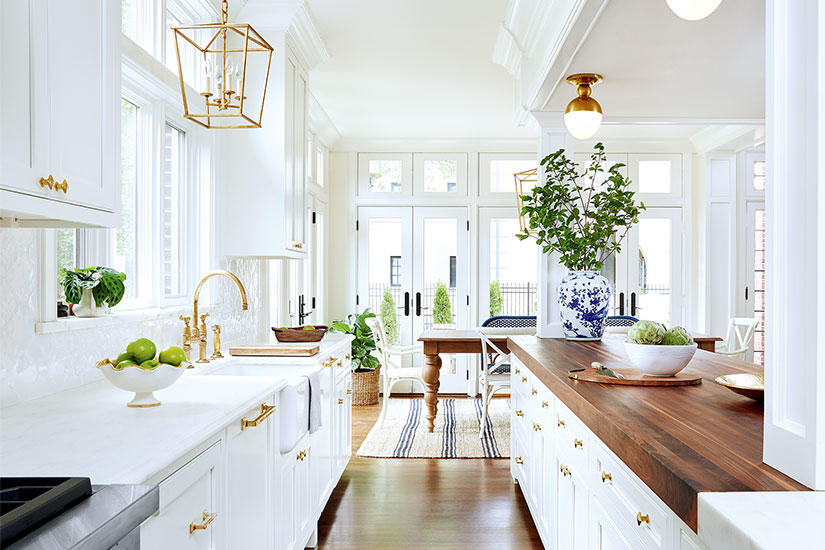
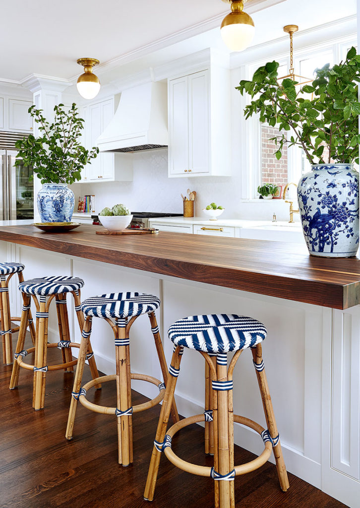
The beautiful eat-in kitchen is home to nautical-chic white shaker-style cabinets with brass hardware, warm wood accents, spherical flush-mount light fixtures, and subtle hits of blue, like the gorgeous chinoiserie vases and bistro stools – timeless and fresh. The flush-mount light fixtures, that were installed by electricians from places like Aardvark Electric, (you can go to website here) can really help to extenuate and bring the other features of the room to life, something that would’ve been hard to achieve otherwise. It is able to pick up the blue in the navy-striped jute rug which adds texture and works really well with the apron sink.
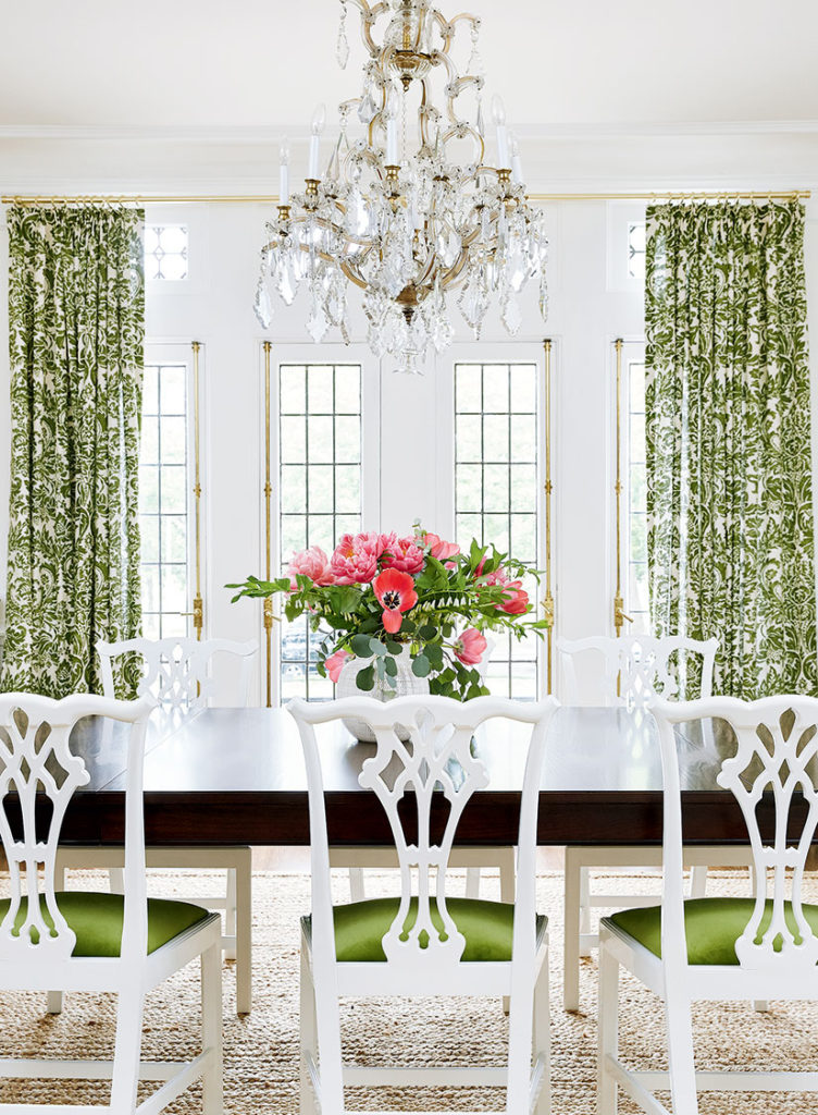
In the dining room vintage wooden chair frames were updated with white lacquer and upholstered in green velvet, which pops against the white. The dark dining table helps to ground the otherwise breezy space. The stunning green damask drapery ties the room together and brings in another traditional element with a modern twist.
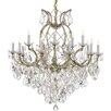
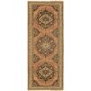
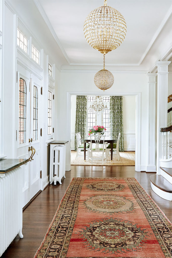
Glamour and old-world patina define the entry way where a blush toned vintage oushak runner is paired with spherical brass-and-crystal pendant lights.
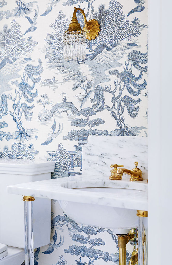
We see beautiful blue chinoiserie again in a grass cloth wallpaper in a show stopper of a powder room. Paired with a Calacatta marble washstand sink with glass legs, exposed plumbing and vintage sconces (original to the home) creates my favorite room in the house. When we had first planned this sink design I was so excited to get in touch with a local plumber that was similar to this charlotte plumbing service so that they could come and install it. Now, I can never stop glancing at the beautiful work every time I go in, no wonder it’s my favorite room in the house!
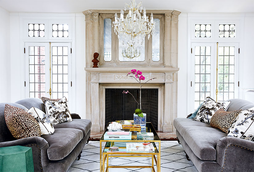
Aime embraces and highlights the beautiful historical elements of the living room perfectly. The Berber-style rug mimics the lead in the windows and the stunning fireplace is allowed to shine on it’s own, with only the addition of antique mirrors. My favorite addition to the room is the shagreen side table and leopard print pillows – completely unexpected, they give a modern and contemporary feel to the otherwise traditional room.
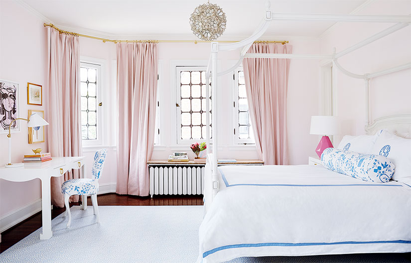
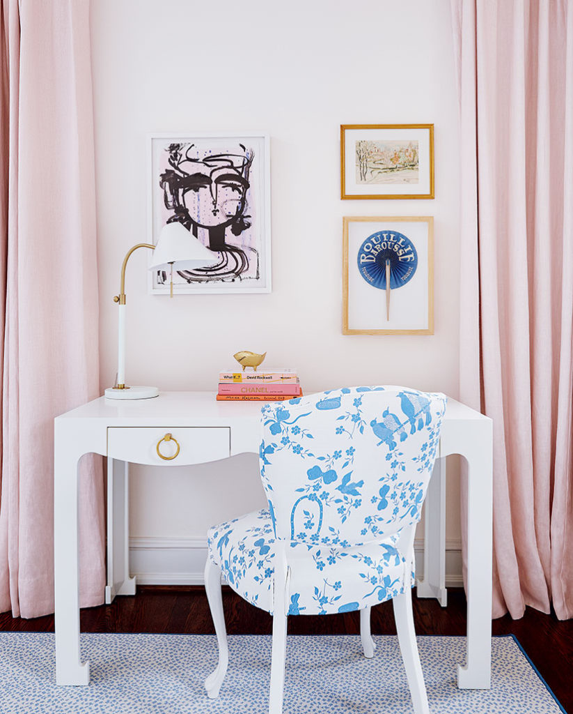
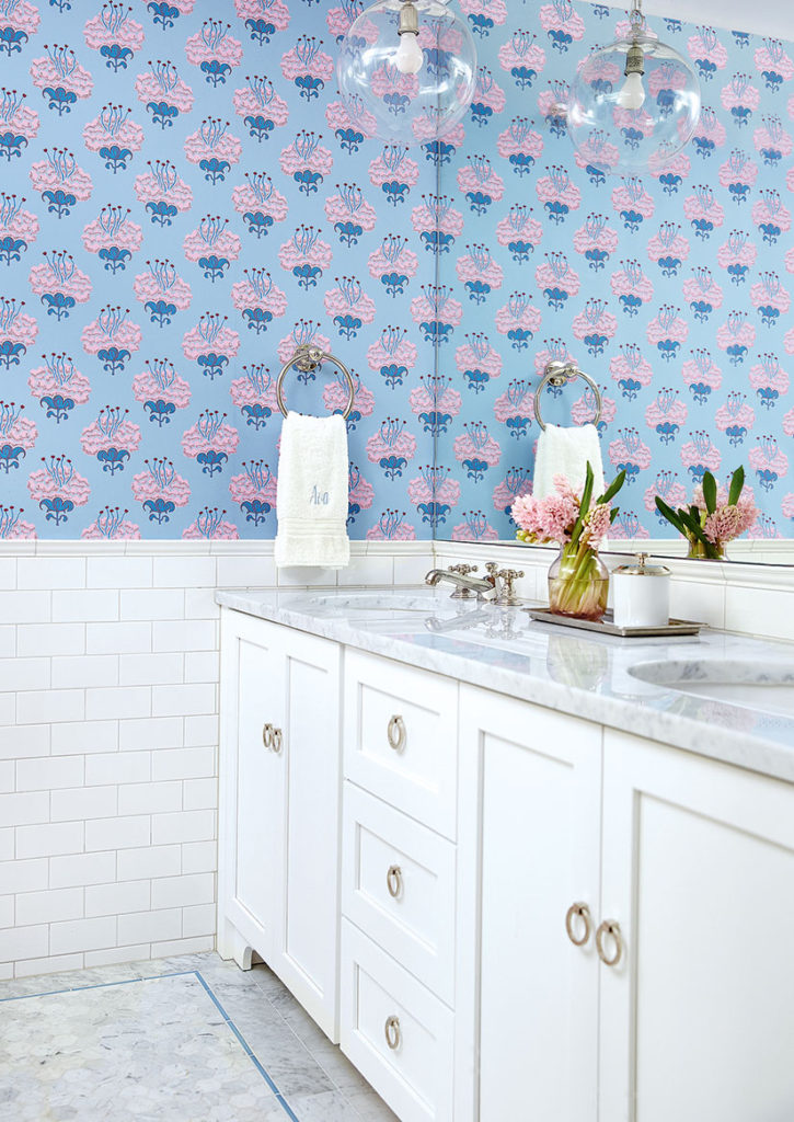
The perfect shade of pink is paired with cornflower blue to create a sophisticated, yet darling bedroom for one of the daughters. A palette that is mimicked beautifully in the bathroom she shares with her sister.
Get the Look
Designer: Aime Corely; Photographer: Ashley Gieseking

