No design project is a straight line. Despite all the planning, attention to detail, thinking and over thinking (me!) there are always twists and turns, unexpected issues, delays, balls get dropped, it happens. And at our Canyon Meadows Project it all happened. Things I could never have imagined happened … for instance the seller passed away days before my client was set to take possession … perhaps setting the tone for things to come.
Thankfully my client weathered each disappointment and test of patience, even when they felt relentless with a spirit of adventure and sense of humor, because at a certain point all we could do was laugh.
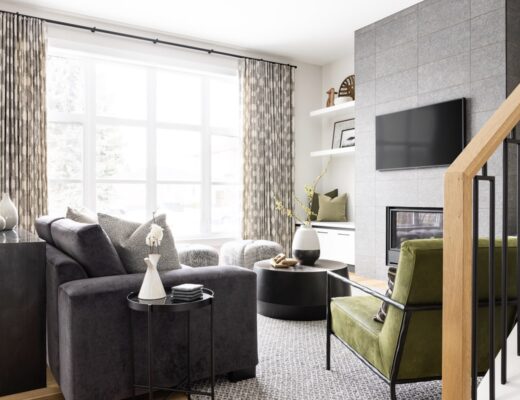
Despite the challenges, delays and frustrations, I’m proud (and relieved) we were able to bring my client’s vision to life. In the end we transformed this 1970s four-level split into a fun space, one that is bold, inviting and totally my client.
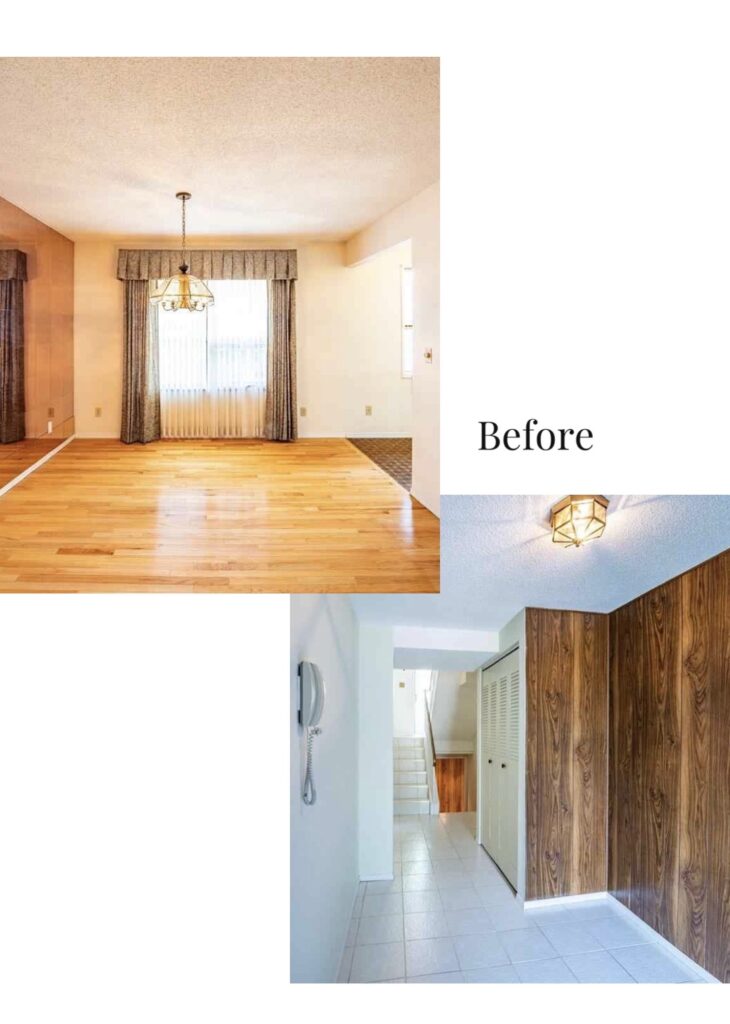
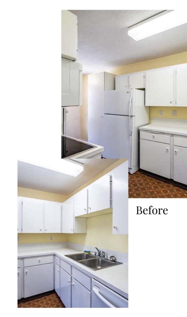
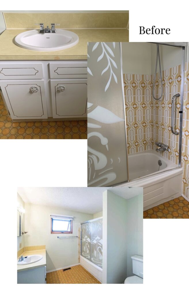
Wood paneling, mirrored walls and classic 70s linoleum. This place had it all.
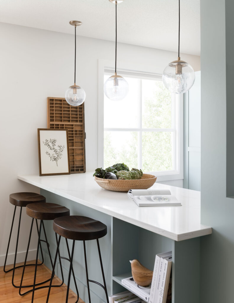
We had hoped to open up the kitchen entirely, leaving just an island to separate it from the dining room. But as walls came down, we discovered we would need extensive structural work to remove the two posts that remain. So we pivoted and did our best to make the posts feel intentional.
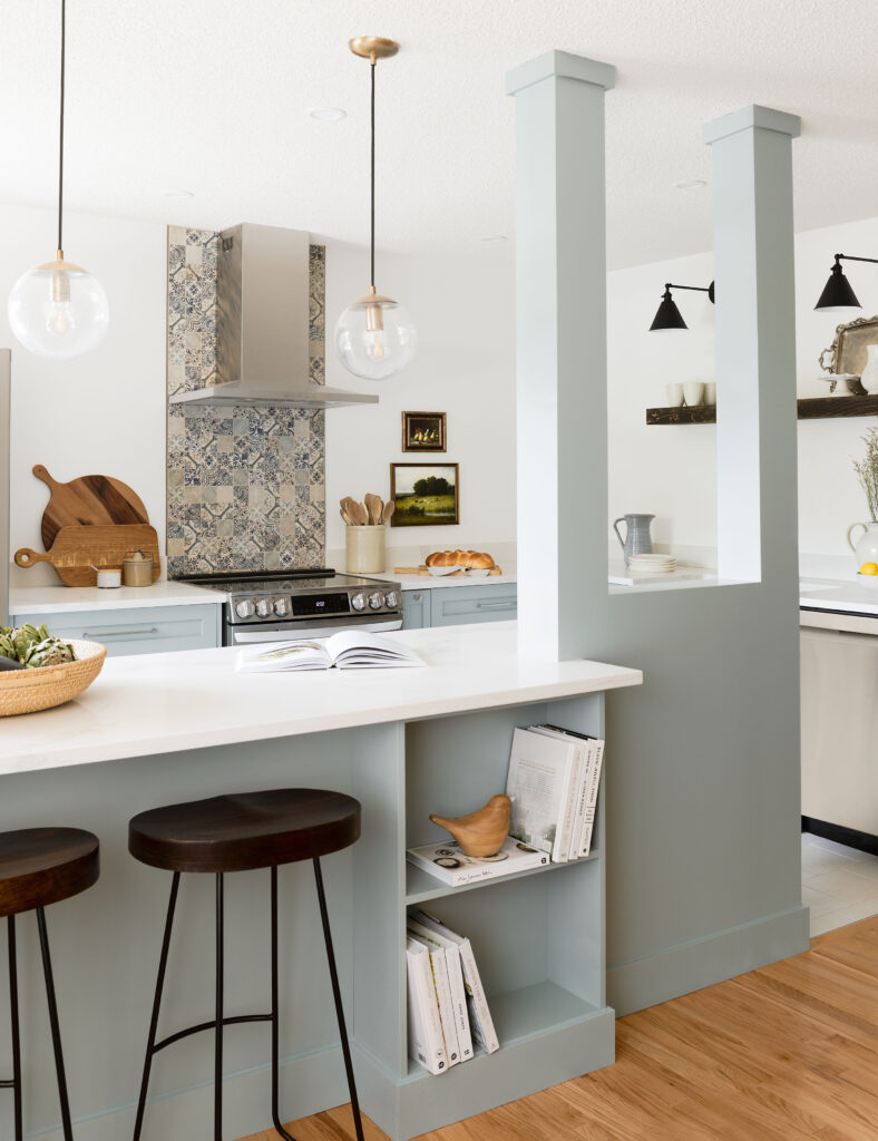
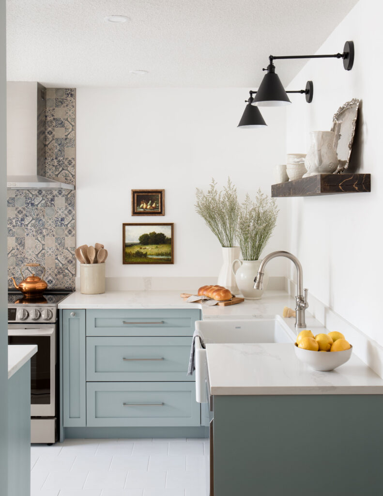
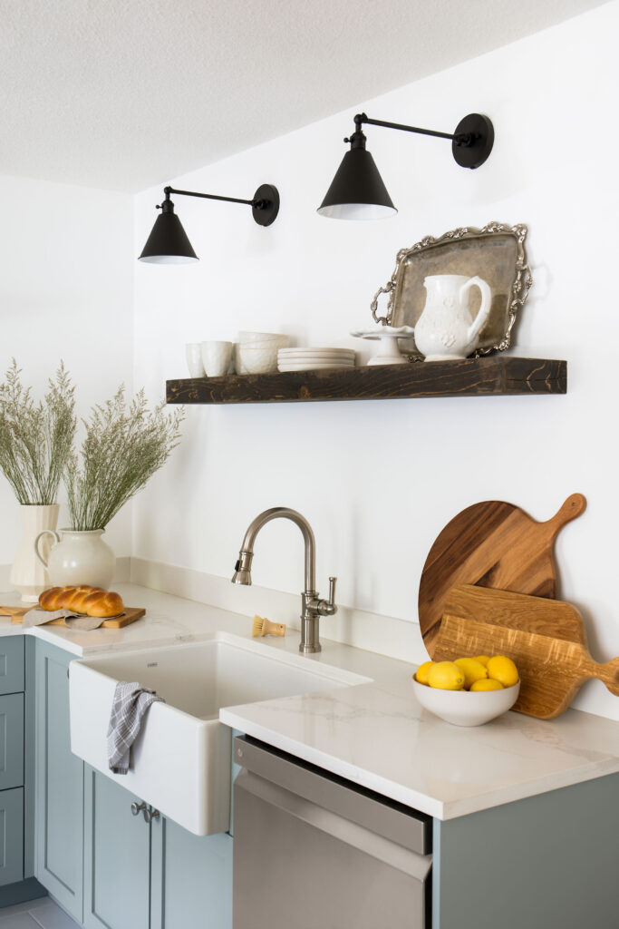
The new island and pantry next to the fridge allowed us to add significant storage and eliminate the upper cabinets, which really opened up the kitchen. To keep the space from feeling flat, we added a natural stone mosaic tile, a rustic floating shelf made to look like a salvaged railway tie and sharp black sconces.
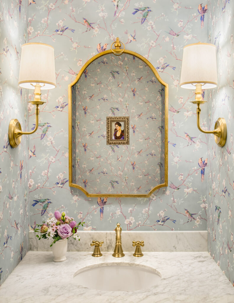
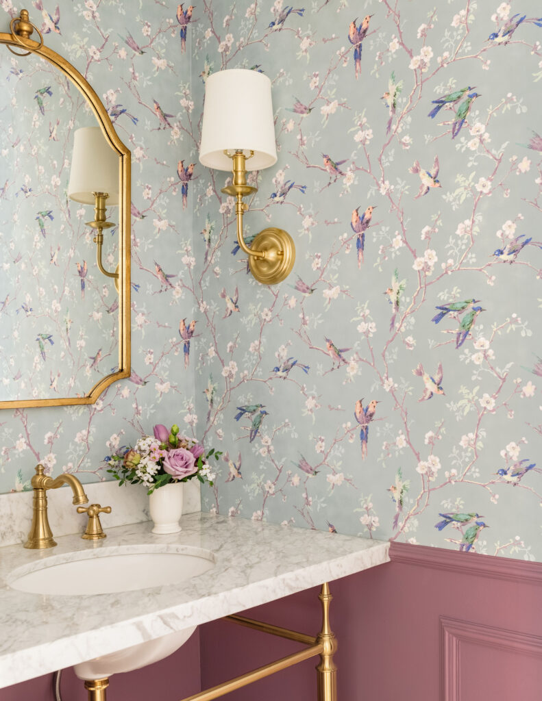
I like to call the powder room the jewel box of this home. It is a special unexpected treat for guests. I was nervous the paint colour might be too much of a stretch for my client, but when paired with the wallpaper, a reproduction from fragments discovered during the restoration of Cardigan Castle in Wales in 1910, it was a no-brainer. The brass accents dress up the tiny washroom and pull it all together.
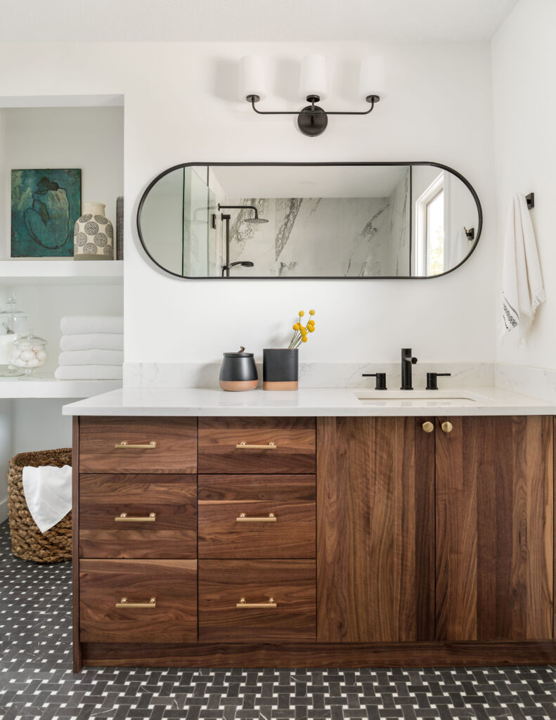
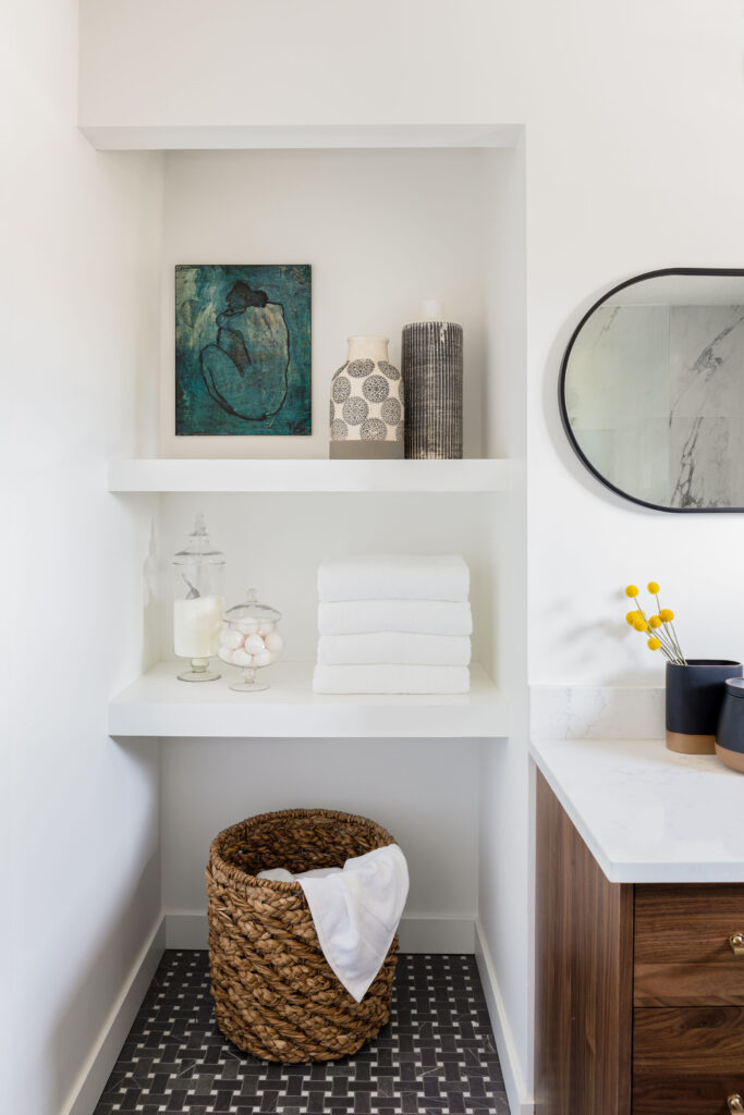
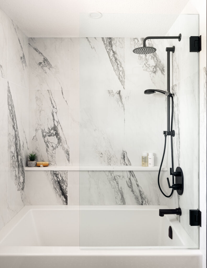
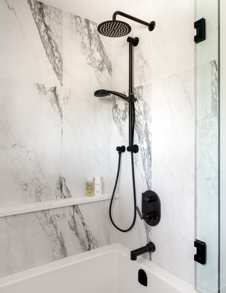
For the primary bathroom, we stuck to our bold esthetic, but chose to use the high contrast of black and white. The bold black veining of the large format shower tile brings a modern edge to the bathroom, while the marbled basket weave floor tile keeps the whole room feeling classic and timeless. The walnut veneer vanity adds warmth and tonnes of storage.
A simple glass partition for the shower keeps the bathroom feeling open and spacious. Adding a hinge (my client’s idea!) not only makes it so much easier to clear, but makes soaking in the tub feel like less like being in a cocoon, something I hope my client is doing as speak 🙂
Design: Neelam Interiors; Photography: Rebecca Frick Photography

