Every so often a project comes along that feels like magic, the kind where it seems the stars have aligned perfectly. That was the case with our Altadore project. From amazing clients who trusted me completely, which was both humbling and empowering, to the exciting scope, perfect location, and trades who brought us over the finish line on time – during a global pandemic – this project was a dream.
Unlike so many updated inner city homes in Calgary which have the same modern, box-like layouts, this home was steeped in beautiful traditional details. While it was those details and craftsmanship that drew my clients to the home, they wanted to add their own sensibility to the space. Brightening it up, easing up on some of the traditional elements, and making it more functional for their busy family of four, which also includes a dog and two cats!
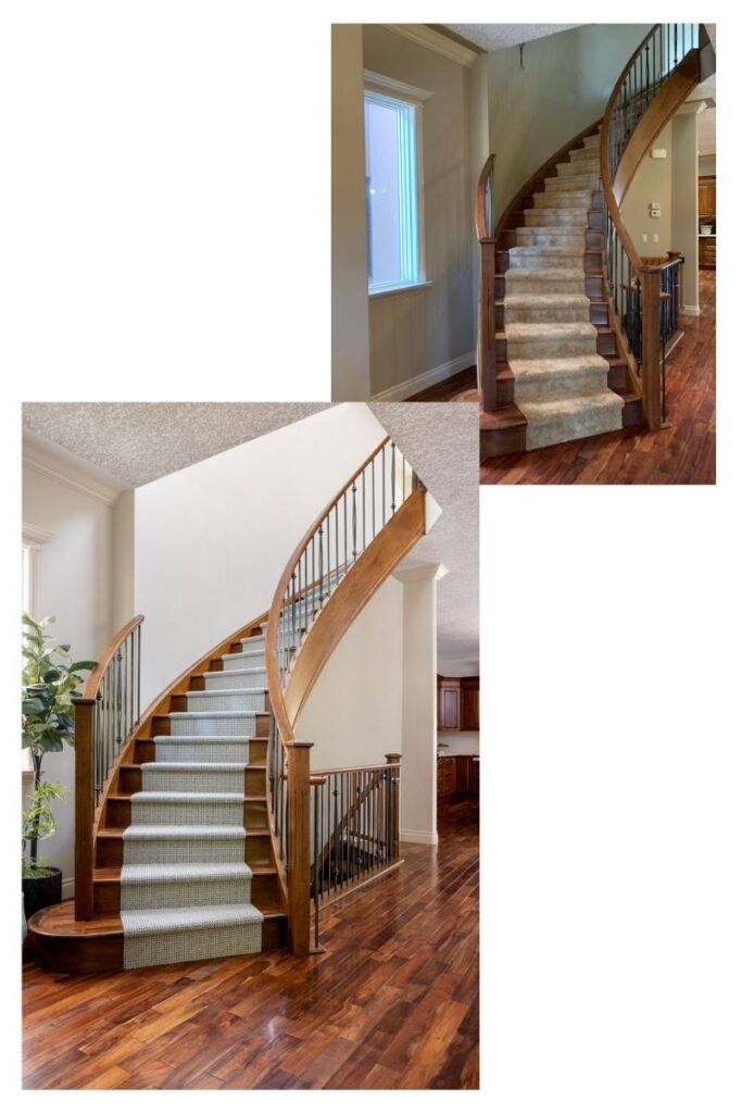
We relied on simple updates, like replacing the existing golden hued stair runner with a wool runner in a modern tonal pattern, smart design and colour to create a dramatic transformation, one that my photographer pointed out feels reminiscent of an Italian Villa. Indeed it does 🙂
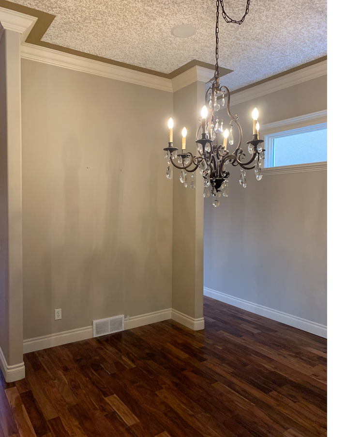
The lack of natural light is a common challenge in most infills in the city. With windows predominately at the front and back of the house, the middle – the dining room and kitchen can feel especially dark. Normally I’d lighten things up by painting the walls one of my favourite white paints, but here we were limited by the mouldings. Although beautiful, they are extensive and painting them out wasn’t in the budget, so finding the right paint colour was key. We settled on a shade that was a near match to the mouldings, only a little cooler to balance the warm tones in the wood floors. To the eye they look like the same colour, which creates the illusion of even higher ceilings.
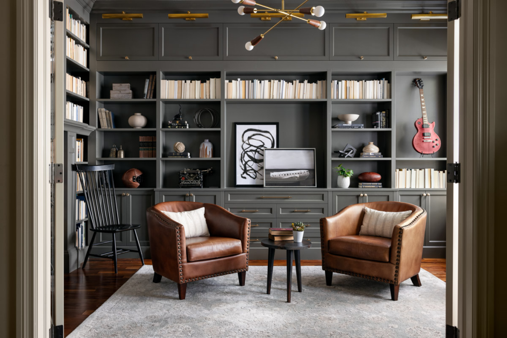
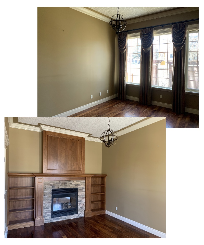
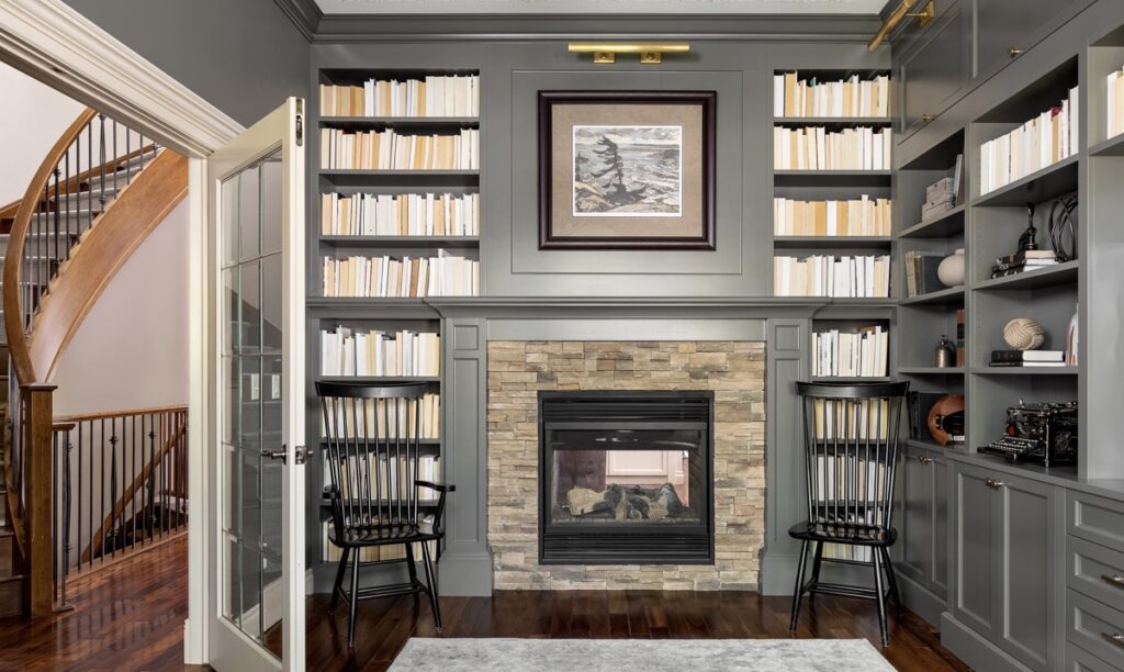
There are so many elements I love about this project, but my very favourite has to be the library/office off the entry way, the transformation is truly striking. With an extensive collection of books, my clients’ goal for this space was to maximize storage and make a statement – boy did we ever!
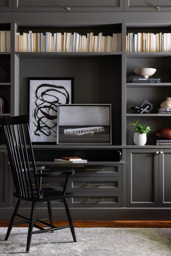
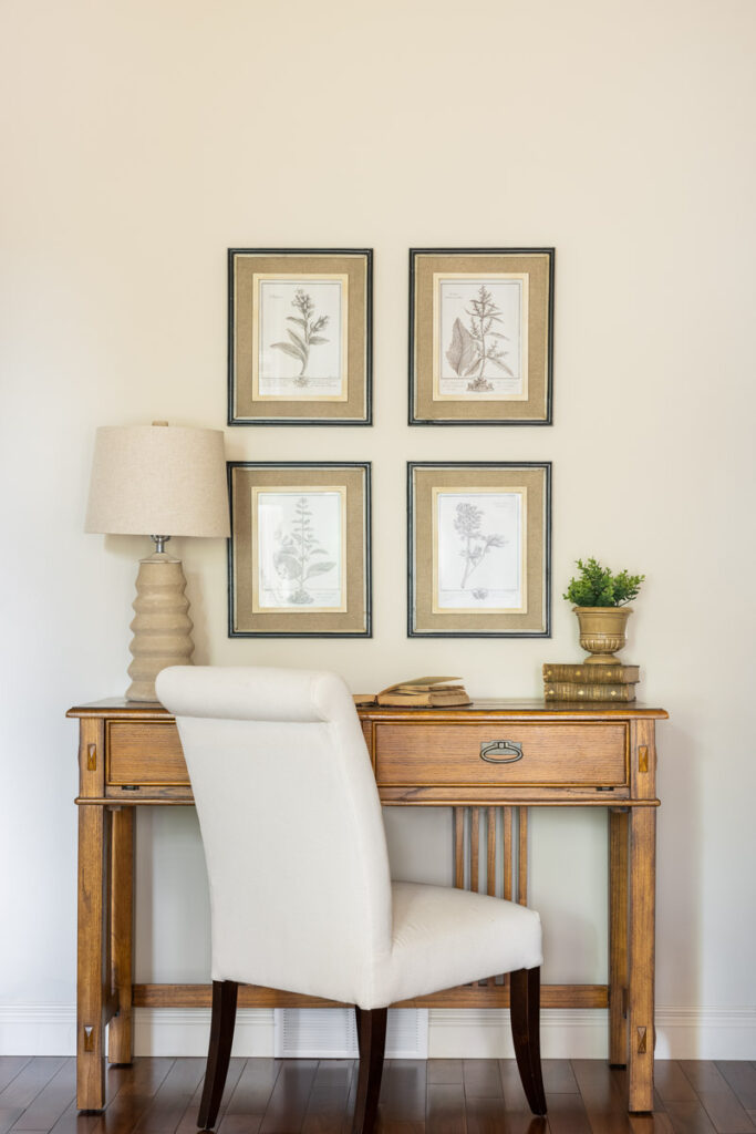
The hidden desk, one of my favourite details, has seen a lot of use over the past year as my clients have found themselves working from home more.
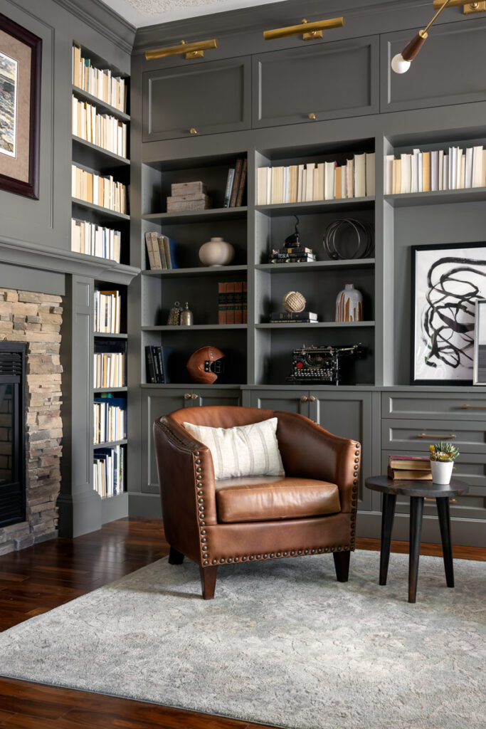
We can’t talk about this room without talking about the colour, a dark and stormy gray. Which reads a bit more of a bluey-gray against the natural walnut floors. It adds warmth and drama in the just right way. The large windows keep the room from feeling too dark or closed in. In a world that seems obsessed with white walls, I love the moody vibes of this room.

Incredibly, the home has three fireplaces on the main floor, all of which were in need of an update. Building the bookshelves out around the library fireplace and painting it, makes it almost unrecognizable.
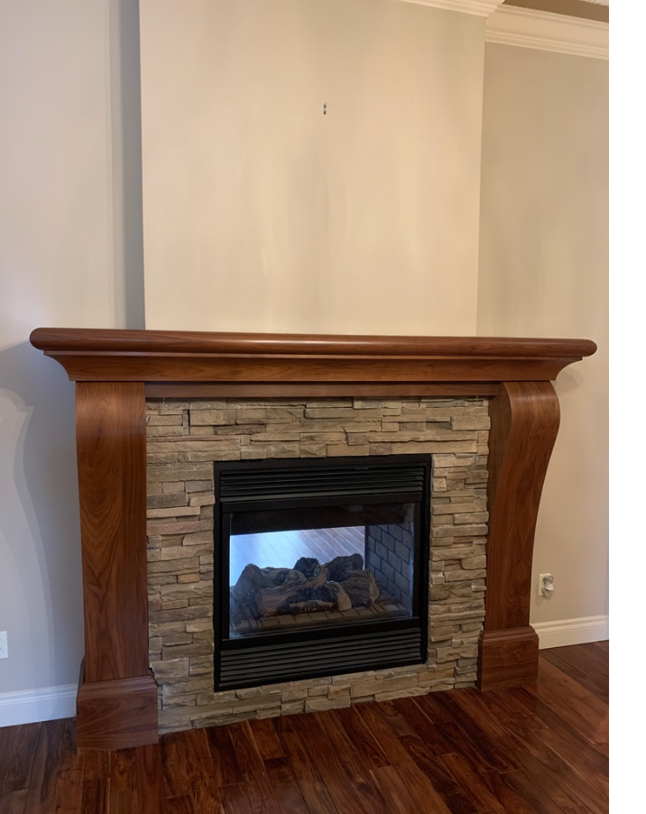
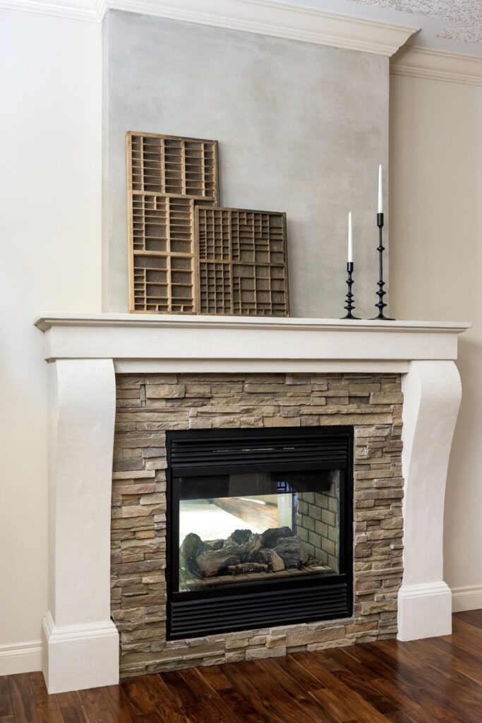
In the dining room, the curve of the fireplace surround was an elegant detail I wanted to keep. We gave it a modern update by squaring the mantle and adding a faux limestone finish to the surround and a concrete finish above. It was a simple and cost effective way to create a big change.
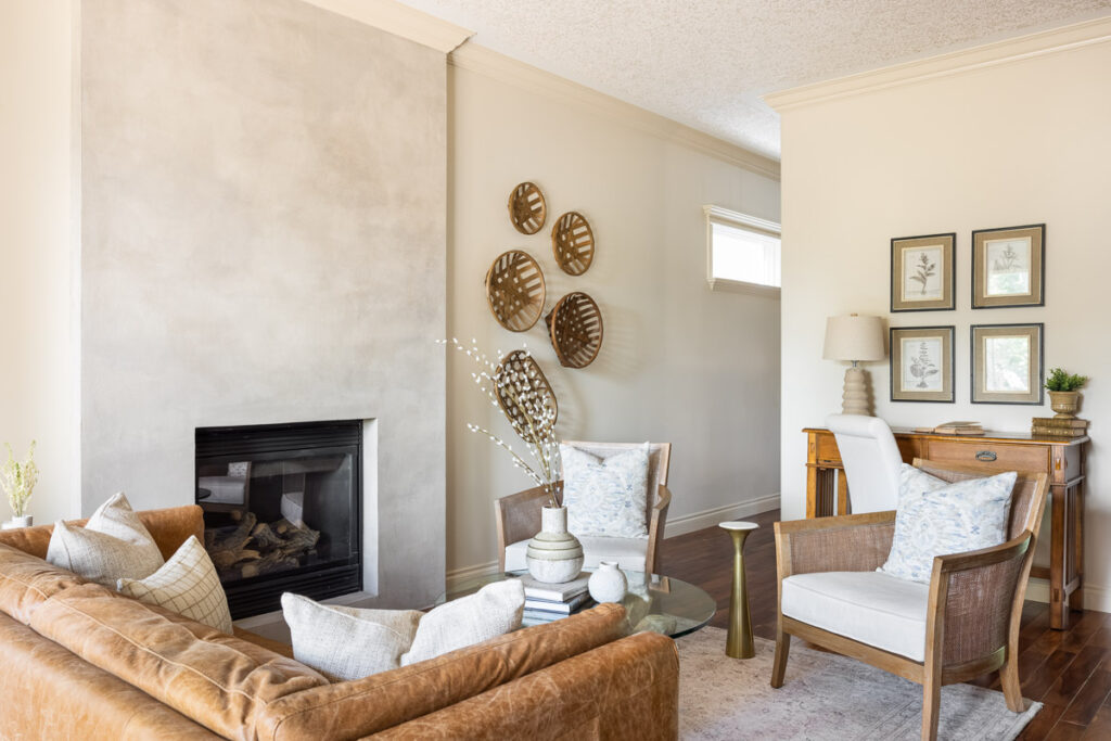
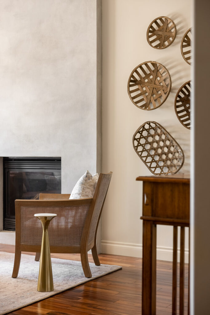
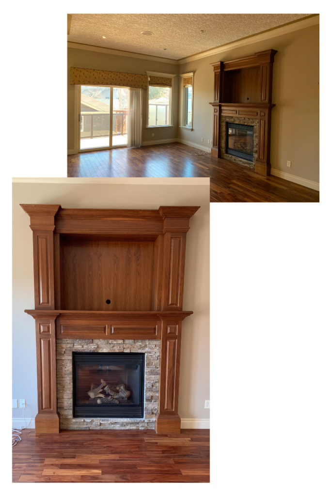
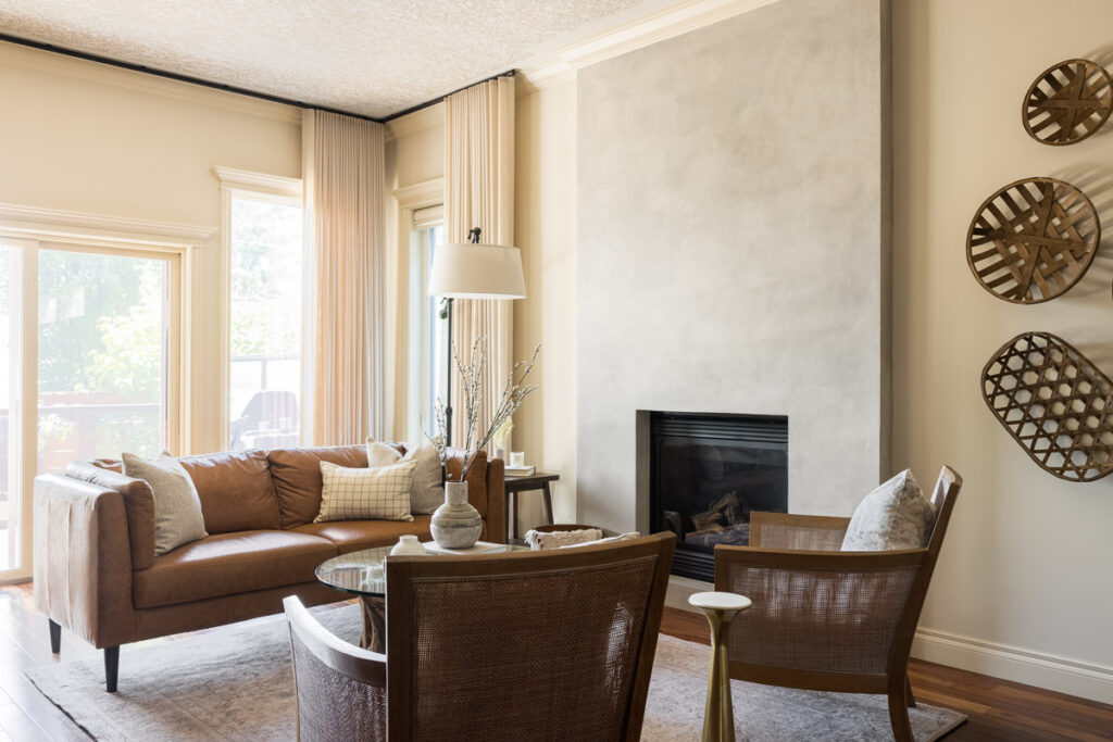
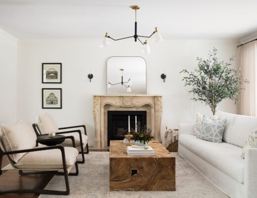
In the living room there was no salvaging the fireplace mantle and surround. It was dated, overwhelming and incomplete (why it stopped short of the ceiling is beyond me!). We eliminated the busyness with a simply box and gave it a concrete finish – which was my client’s idea! I had suggested a stone finish, but he was excited by the possibility of incorporating concrete. The key to making it work was getting the tone right, most concrete finishes are cool, with blue undertones, given the warmth of the wood and creaminess of the walls, that wasn’t going to work. In the end, I think we nailed it. I love the juxtaposition this fireplace creates with the traditional elements in the space.
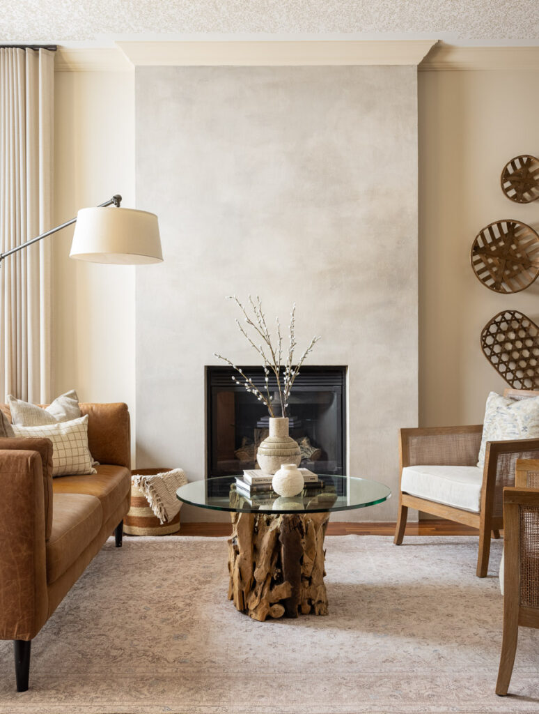
Before we move on from the living room, let’s have a moment for the custom drapery. If you’ve been around for any length of time, you’ll know how important and transformative I believe drapery can be. Here’s another example if you’re not entirely convinced 🙂
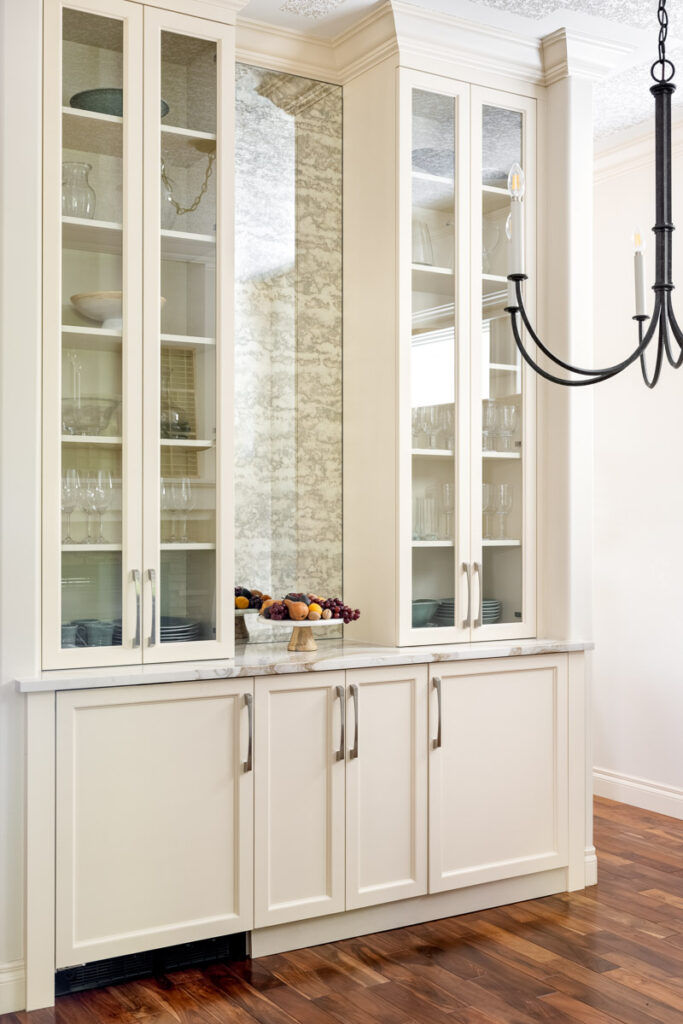
The alcove in the dining room just screamed for a custom built in. So we designed one with glass paneled doors that run all the way to the ceiling. The antique mirror between the two towers helps to reflect light in the shadowy dining room and adds an old world touch that ties in beautifully with the antiques sprinkled throughout the home.
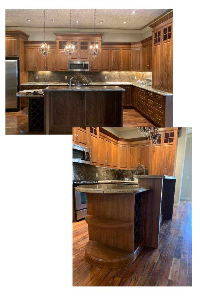
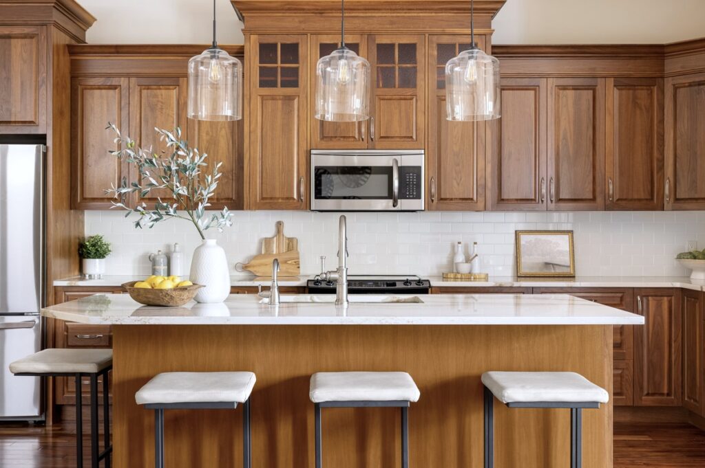
The budget didn’t allow for a complete overhaul of the kitchen and to be honest, given the beautiful walnut cabinetry, I wasn’t too upset about it. We modified the island, removing the elevated breakfast bar, which instantly made the entire kitchen feel bigger and so much more functional. We replaced the existing granite counter tops with a beautiful quartz, added a simple subway tile and updated the lighting to give the kitchen a whole new lease on life. Not pictured, but probably my clients favourite part of the kitchen transformation – the waste and recycling pull out we were able to add in next to the sink!
I hope you’ve enjoyed this client reveal as much as I’ve enjoyed sharing it with you! I’d love to know what your favourite part, room, or element is in the comments below!
Photography: Klassen Photography


I’m in love with everything you’ve done on this project! The office is especially dreamy, moody perfection. Could you share the source on the light fixture?