For me the design process has always been a fluid one, navigating unexpected surprises, while maintaining budgets and timelines, but never more so than in the last year and a half. The endless pandemic related shortages and delays, have challenged all of us in the industry and most especially our clients to be nimble and patient.
Nothing could be truer for my clients at our Livingston Project. Having worked hard to build their new home, my sweet clients reached out early to start the furnishing process. Despite the extra lead time we couldn’t get ahead of the Covid supply issues, which had us re-evaluating, re-selecting and finally releasing – trusting that things would show up and be worth the wait. Thankfully, I’m happy to report, that nearly a year to the day we first met, my clients home is complete and it was indeed worth the wait.
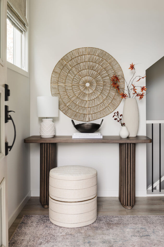
I’m a firm believer that the entry way sets the tone for the rest of your home and this one does just that, while being super functional. The pièce de résistance is the beautiful console table, inspired by the décor of the majestic palaces of Jaipur.
If I had to pick a theme for this project it would be colour. Once again the husband in this lovely duo wanted colour and pushed me and his wife to incorporate it into the spaces we worked on. It was a fun albeit challenging (at times) task, but I’m so happy he did. It pushed me to create a bolder, more thoughtful palette. I think the reason neutral spaces are so in vogue is because they are so much easier to pull together. When working with colour, it’s much important to get the balance right, without it a space can feel abrupt and disjointed. I think we were able to nail it in this home.
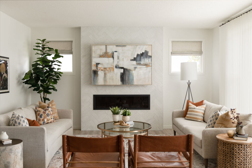
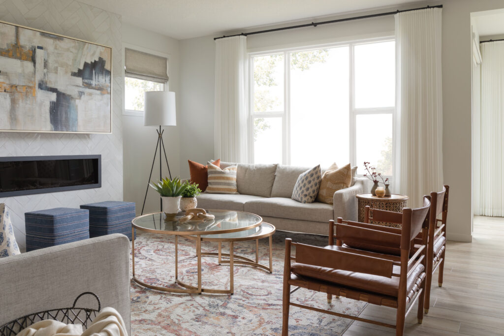
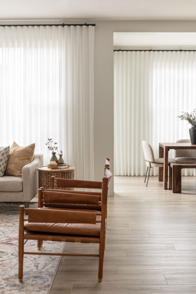
Each space we tackled had it’s own particular challenge. In the living room, my clients wanted to be able to entertain their large family and friends, with ample, comfortable seating. Rather than simply filling the space with furniture, we were thoughtful in the pieces we chose. The two sofa’s differ in style, but were upholstered in the same fabric, to give a sense of cohesion. The ottomans offer flexible seating and a great place to put your feet up at the end of a long day. The nesting coffee tables again offer flexibility without being overbearing. And my favourite element, the safari chairs, offer a deep, comfortable seat without being bulky. They are also a gentle nod to my client’s African heritage. I would be remiss not to mention the rug, it was after all the springboard for the room. Made to look like thousands of small mosaic tiles, it feels both ancient and current, my favourite mix.
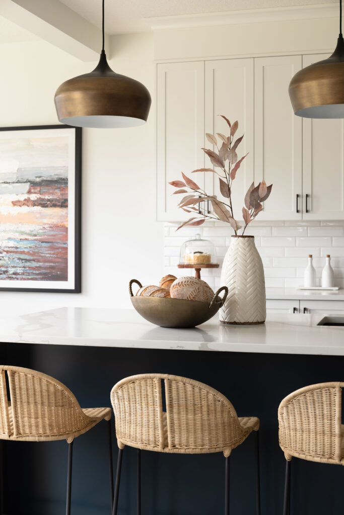
The dining nook posed the biggest challenge of all – long and narrow. Finding a table that offered the ability to host large gatherings without feeling like a conference table was a challenge. I may have let out a little yelp when I came across this table, made of large planks in a beautiful mid-tone brown with a subtle asymmetrical detail in the legs, it really felt like it was made for this exact space. The bench allows for flexible seating, room to squeeze extra people in when needed and easily pushing out of the way to keep the space feeling open. The Art Deco inspired dining chairs, offer a very comfortable seat to enjoy long dinners. The rounded shape and textured fabric, offer a great contrast to the substantial table.
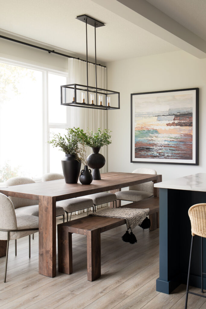
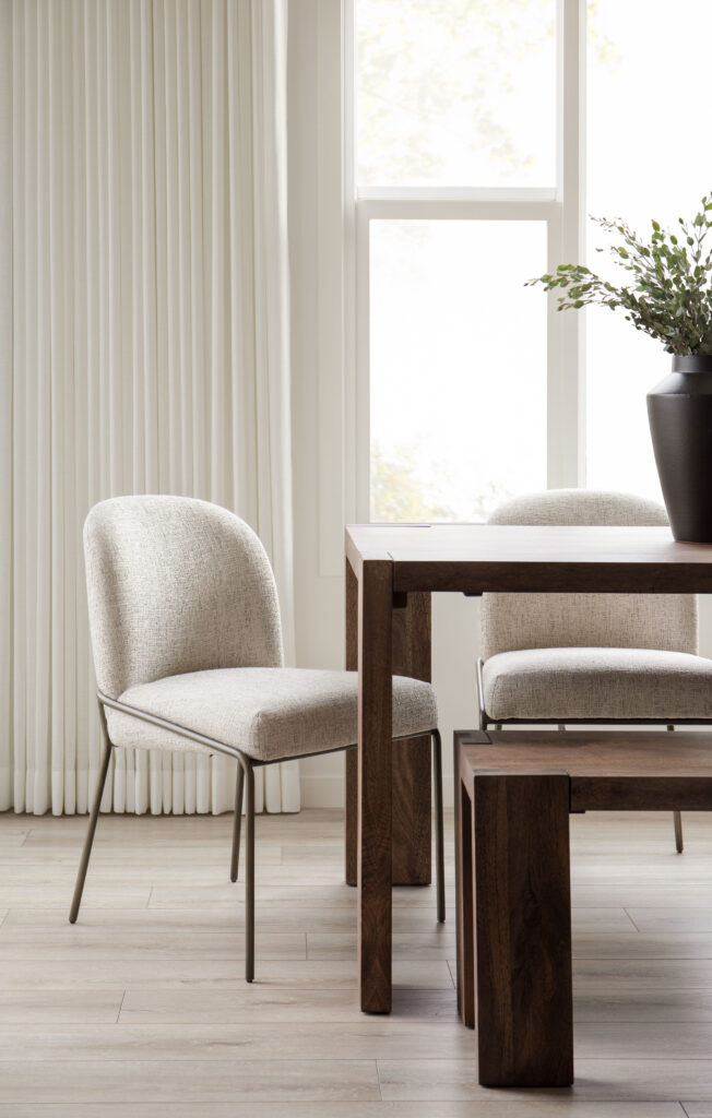
If you’ve been here for any length of time, you’ll have heard me talk about my love of drapery. Such a small part of a room, and so very easy to overlook or omit when trying to tighten up a budget, it is in my opinion by far and away, the best investment you can make. As in this case the drapes create a beautiful connection between the living room and dining room. They accentuate the height of the rooms while adding a softness. By choosing a fabric that matched the walls, we kept their presence subtle. We did have a bit of fun with a grey herringbone for the roman shades in the living room, which mirror those in the entry way, creating a beautiful consistency.
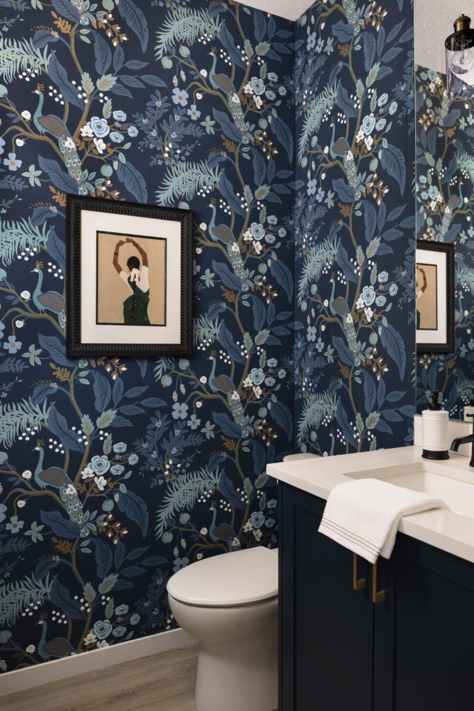
The powder room in this home is a little jewel box if ever there was one. A not so subtle, but elegant nod to my client’s East Indian heritage, the peacock wallpaper is bold and playful, and ties in perfectly with the navy millwork. And the artwork of the traditional Bharatanatyam dancer is, in my opinion just perfect.
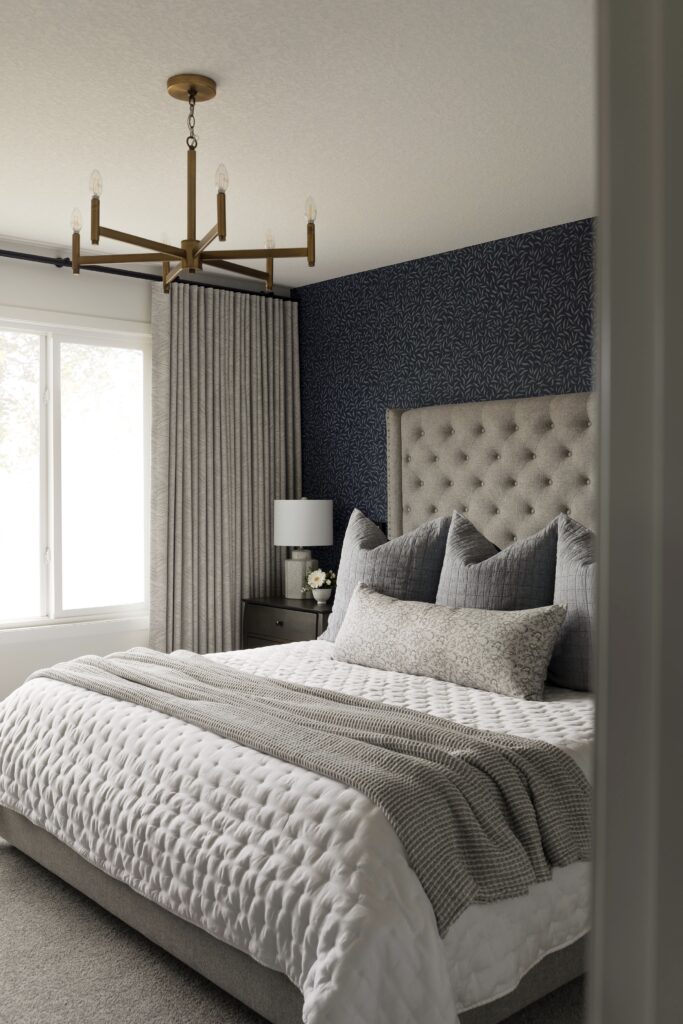
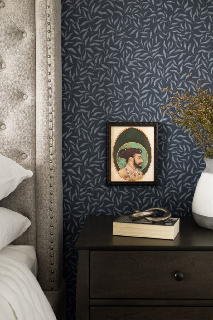
And lastly, my favourite space – the primary bedroom. The beautiful bay leaf wallpaper, textured drapery, layered bedding and, vintage Mughal art come together to create the most beautiful sanctuary. I’m not sure how my clients ever leave this room!
What’s your favourite part of this home? I’d love to know in the comments below.
Design: Neelam Interiors; Photography: Rebecca Frick Photography


The whole room is soo beautiful, really i am obsessed with this place and specially love the ceiling lights, all are amazing, thanks dear for sharing.