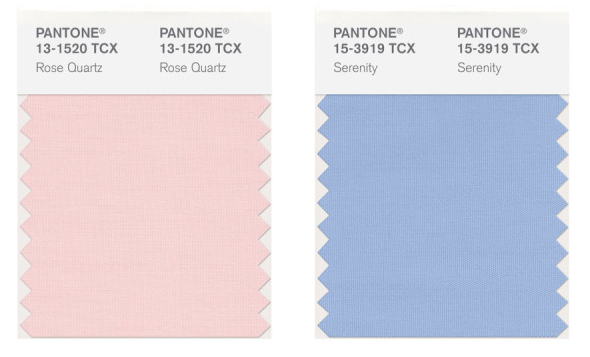
It’s that time of year again – when Pantone, the global authority on colour and provider of professional colour standards for design industries, reveals the colour of the year. Shockingly, for the first time ever, they announced two colours of the year – Rose Quartz, a pretty pink and Serenity, a bright periwinkle blue.
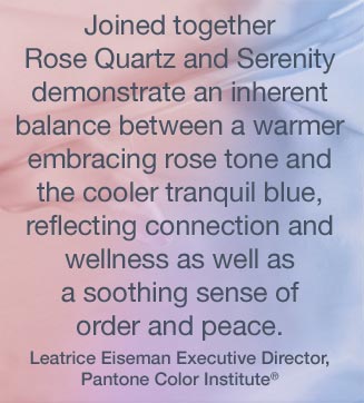
Theories abound on the choice of two colours and these two colours in particular, everything from a global need for calm and tranquility to the blurring gender lines in many parts of the world.
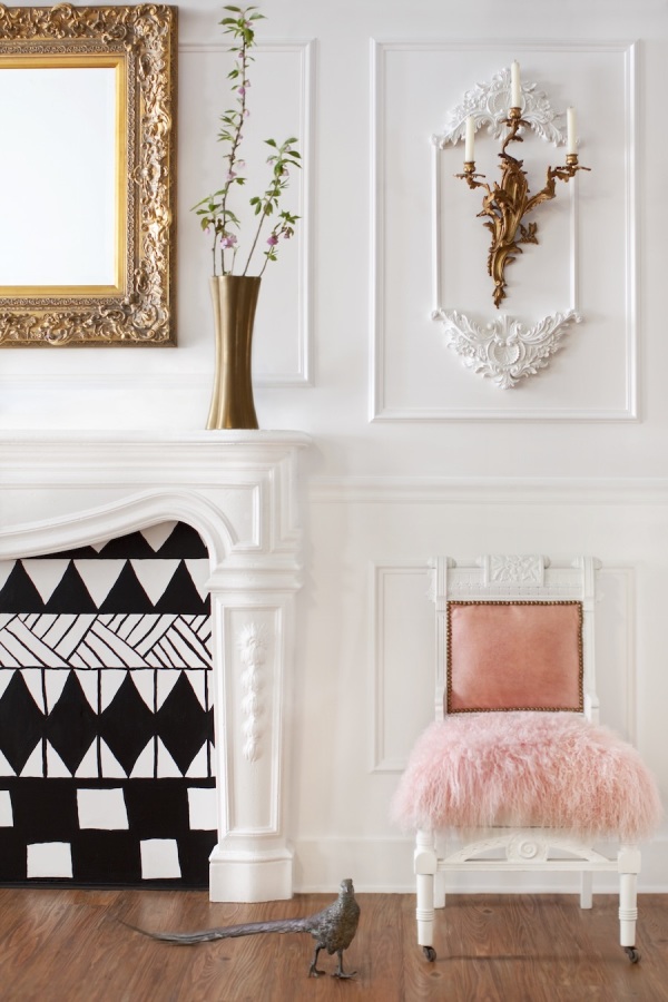
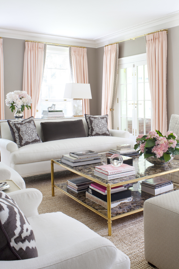
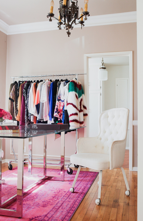
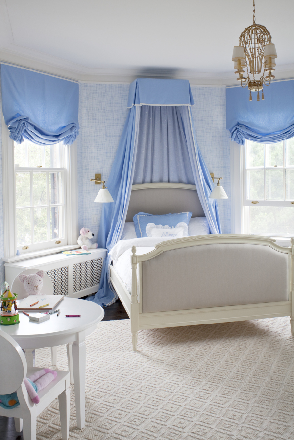
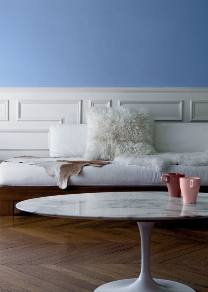
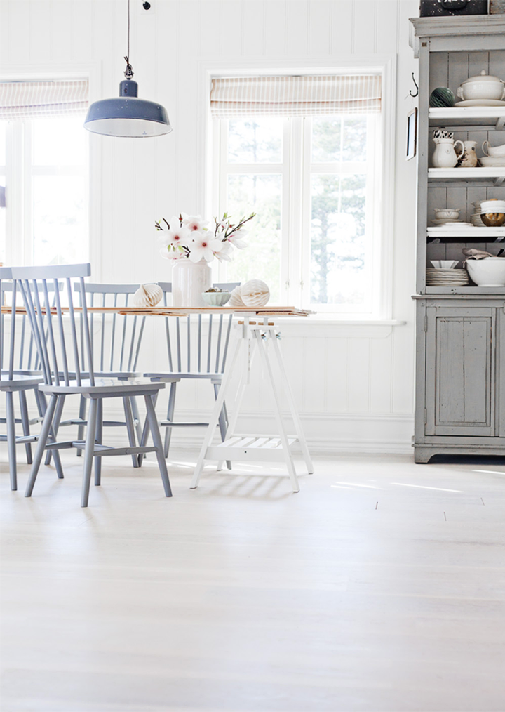
No matter the reason, the two colours are lovely, Rose Quartz is soft and feminine without being juvenile, while Serenity is bright and sweet, without being overpowering, together the two shades are magical and pair beautifully with greens, purples, browns, yellows and pinks. Or create a bold look with silver or hot pink!
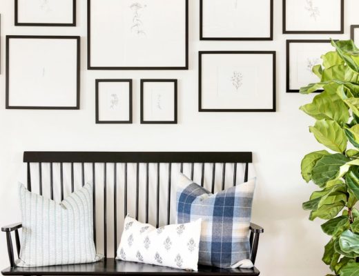
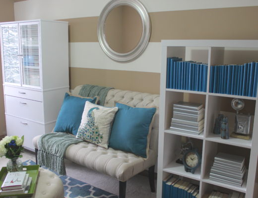
Not sure how to incorporate these colours into your space? Not to worry, I’ve pulled some inspiration for you below 🙂


I absolutely adore both shades, especially Serenity. They are both very approachable colors. :]
// ▲ itsCarmen.com ▲
Agreed! I just love them paired together. Sublime!
xx
Neelam