Some things quintessentially define an era, shag carpet? The 60s and 70s. Boy Bands? The 90s. Golden Oak? The 80s. Perhaps not the worst thing to come out of the 80s, (my hair could top that list), but definitely a ubiquitous feature in homes. Our Coach Hill Project was no exception. There was golden oak – everywhere – except, shockingly the kitchen – because it had been renovated.
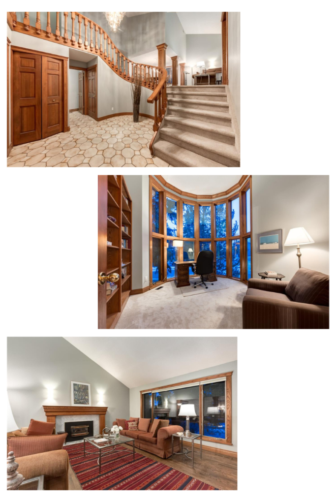
Needless to say the oak had to go.
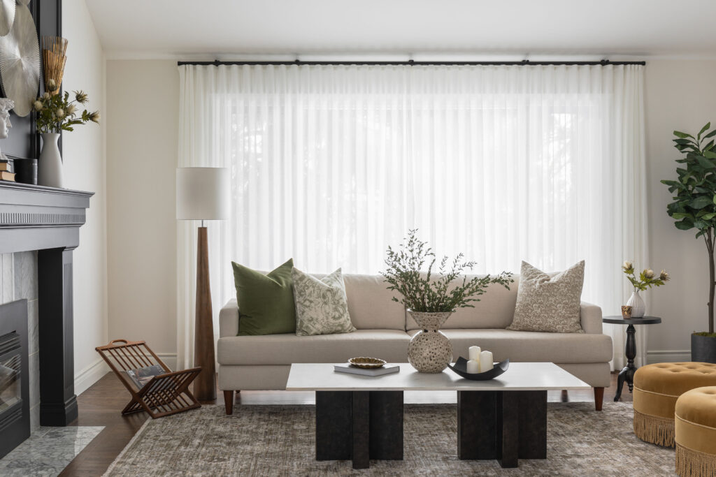
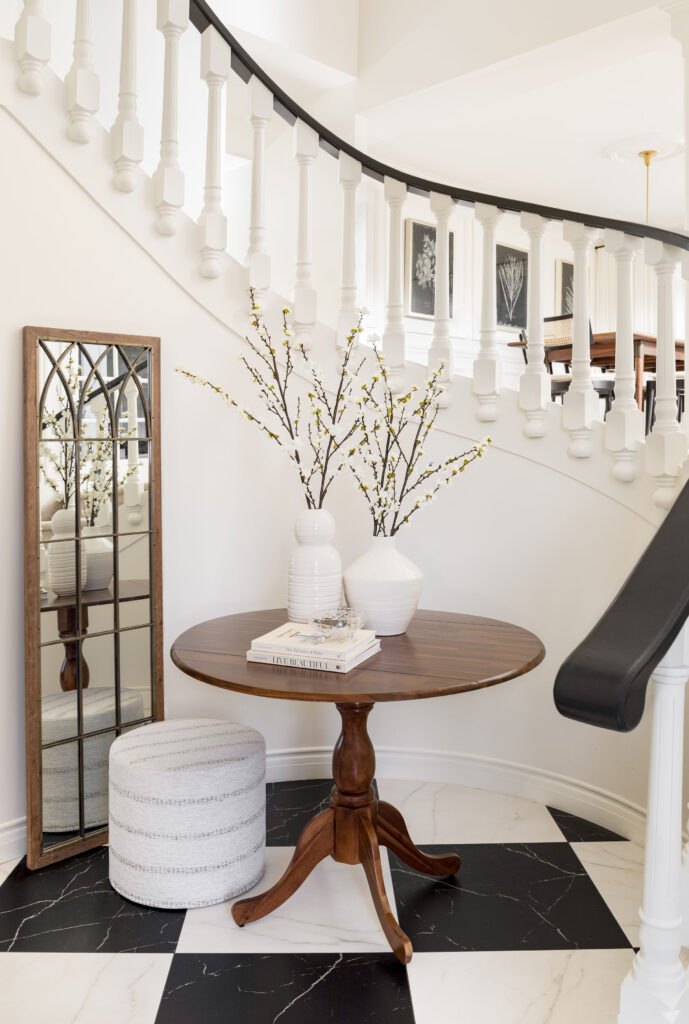
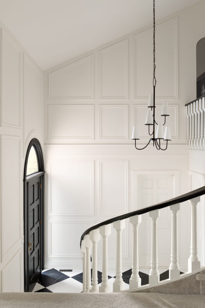
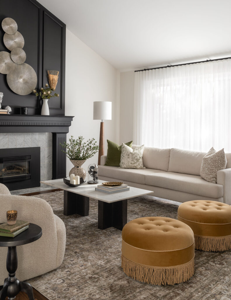
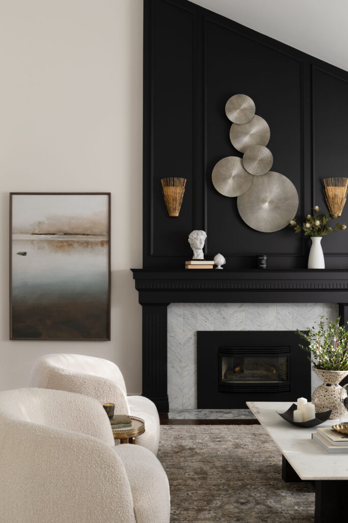
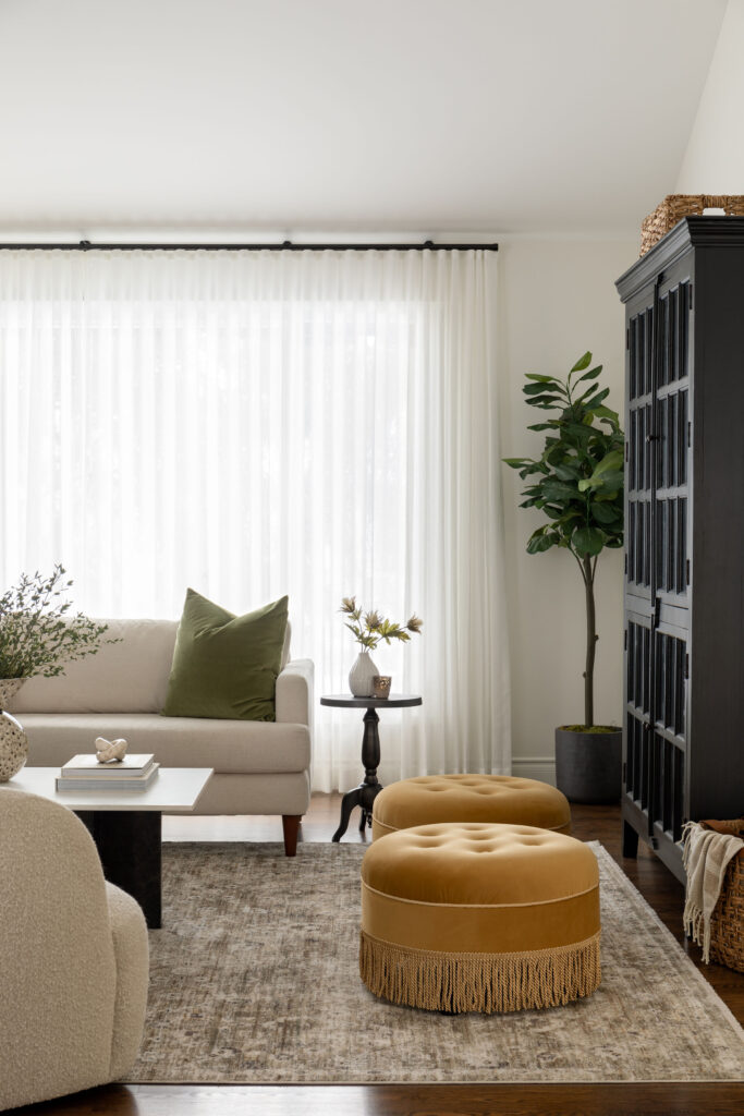
We started with a classic white on the walls and trim. To that we added in punches of black for drama, and cream and moss green for warmth and depth. If you’ve been here for a while, you know I like to re-imagine spaces whenever possible. Keeping some of the original traditional features, like the railing and living room fireplace mantle and surround. But updating them in a way that was bold and fresh. Each and every room in this home had a dramatic transformation, I’m hard pressed to pick my favourite, can you?
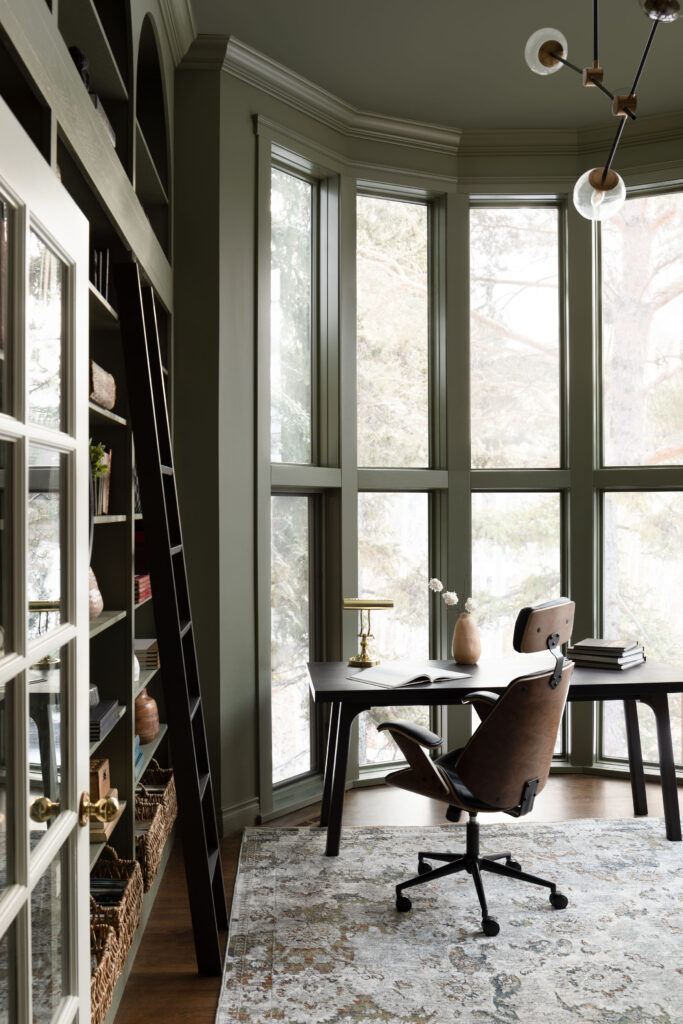
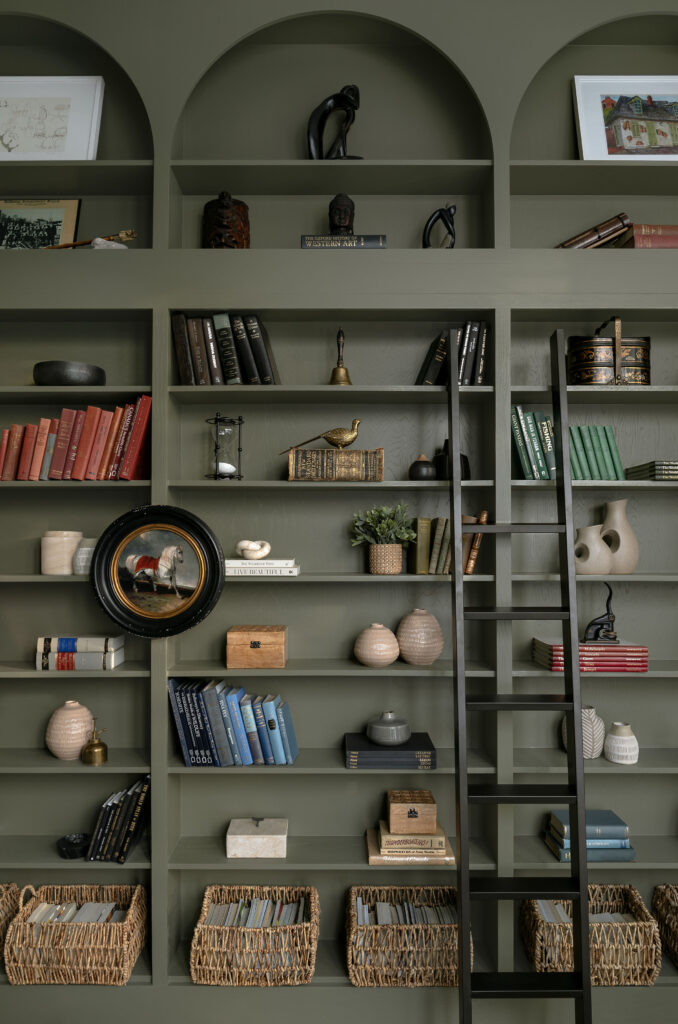
The height and windows in the office were such a beautiful feature. But the oak trim over powdered the windows. And the original bookshelves, which stopped three-quarters of the wall up the wall, actually made the room feel squat. By extending the bookshelf to the ceiling and painting everything a beautiful mossy green, the room feels like a cathedral.
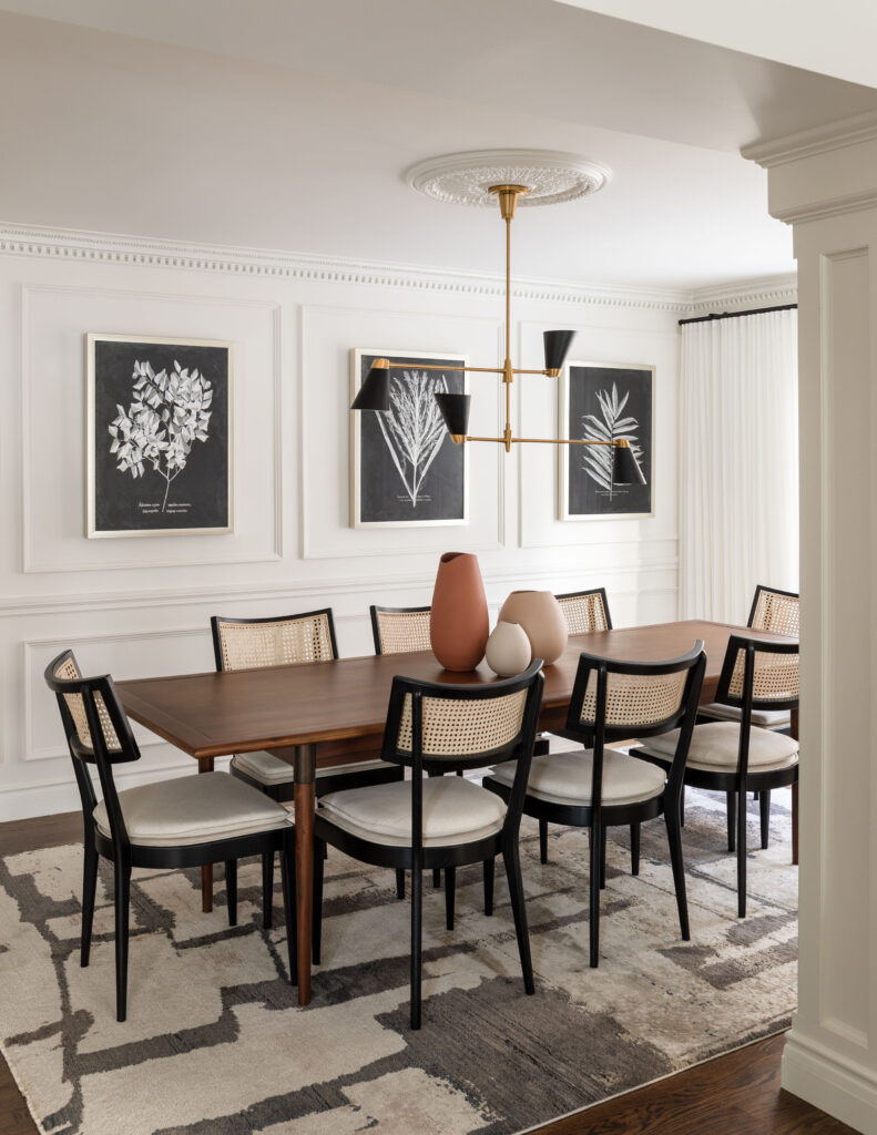
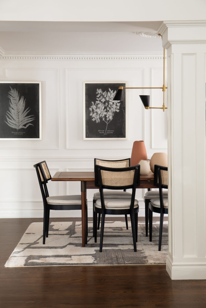
In the dining room we accentuated the existing dentil crown moulding and plaster ceiling medallion, with panel moulding and a chair rail. Creating the perfect backdrop for oversized black and white botanical art.
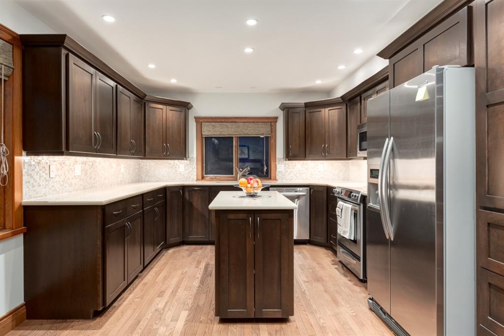
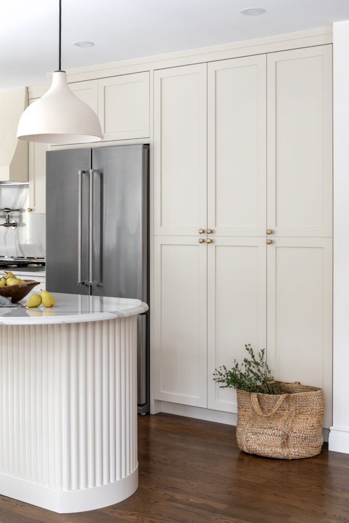
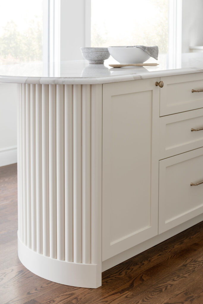
Although the kitchen had been renovated, it left a lot to be desired. Mostly room to have more than one person in it at a time! The tiny island was more of an obstruction than anything useful for my client’s, a multi-generational family that love to cook together. We left the footprint the same but removed the left bank of cabinetry and extended the island – to ten feet! Removing the cabinetry, not only opened things up dramatically, it allowed us to add depth to the island and a second window. Who doesn’t want more natural light in a kitchen?!
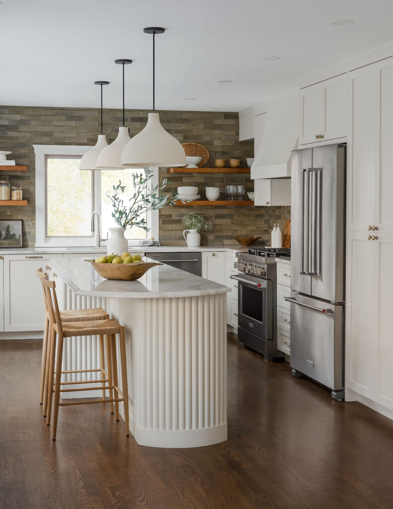
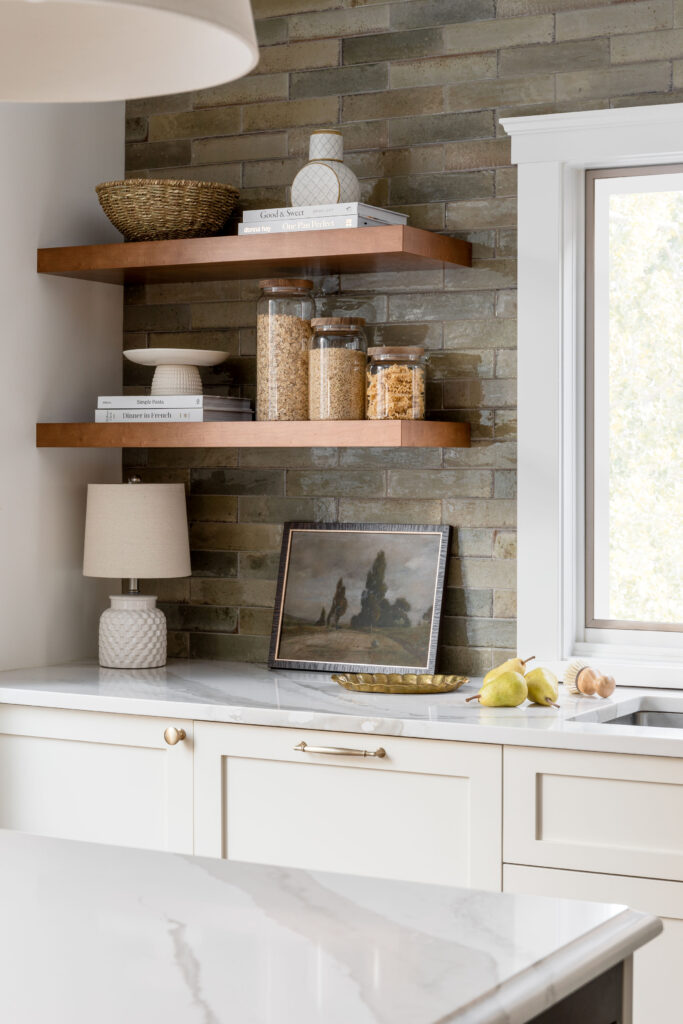
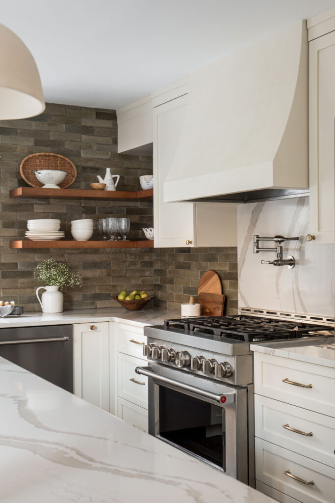
We played off the texture and variation in the backsplash tile in the range hood, giving it a faux plaster finish.
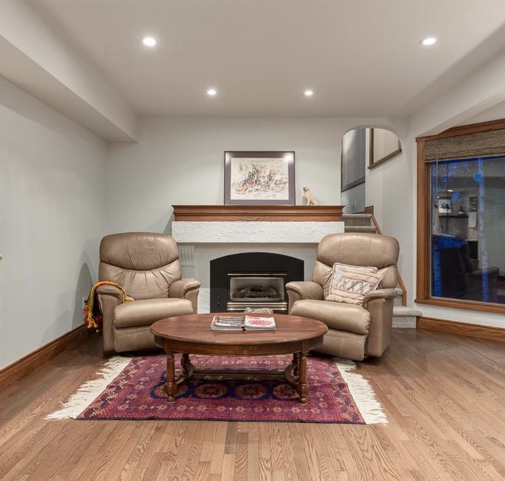
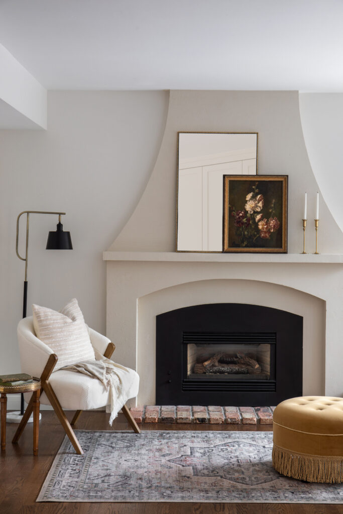
The seating area just across from the kitchen, while well-intentioned, felt more like an after thought. Since moving the firebox or the stairs to the family room, weren’t in the budget,we reworked the surround. Extending it to the ceiling made the fireplace feel intentional. While the soft curve, which mimicked the range hood, and narrower profile minimized it’s awkward placement. We finished it the same faux plaster finish as the range hood.
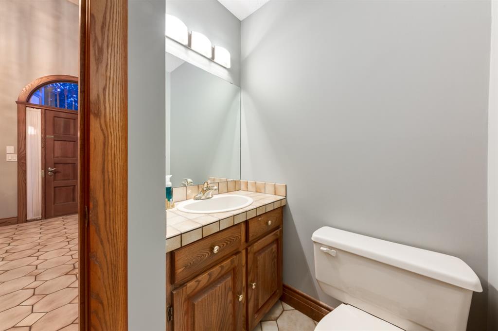
We took the black and green to extreme in the powder room, paining the entire room black, adding a chair rail and whimsical papaya wallpaper.
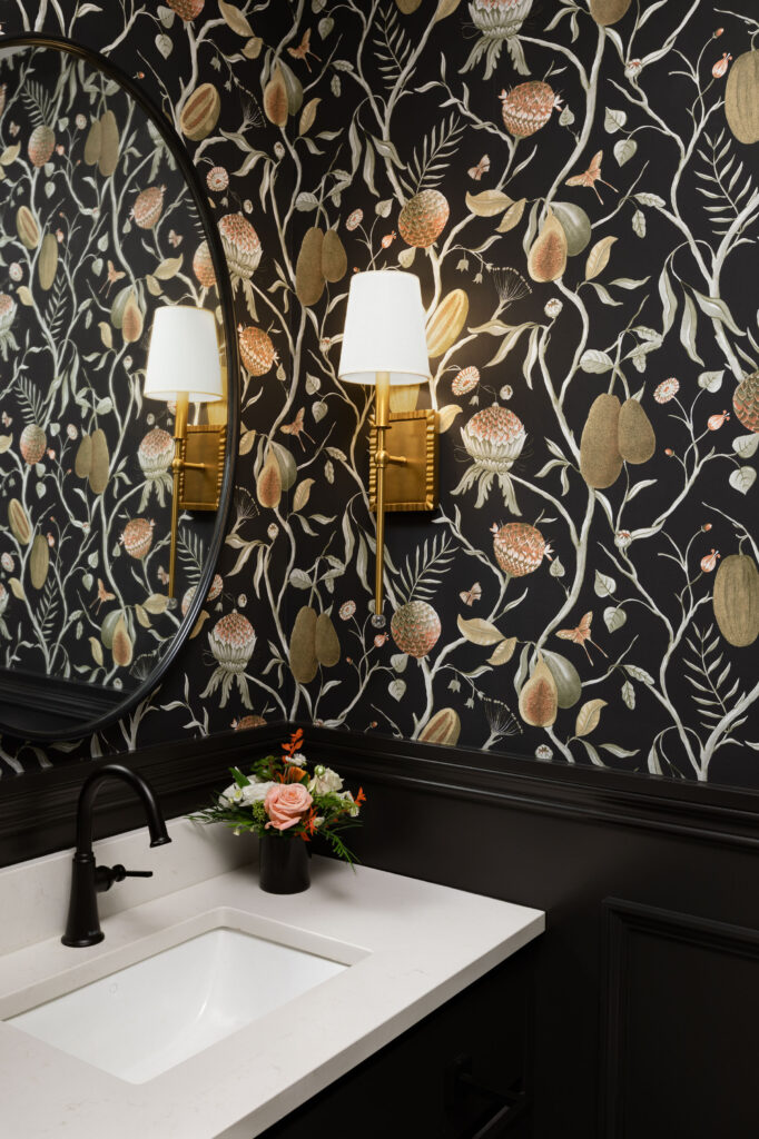
Design: Neelam Interiors; Photography: Rebecca Frick Photography