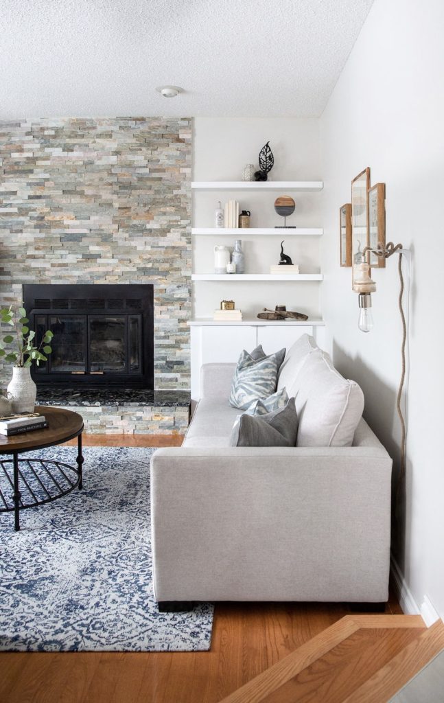
One of the biggest misconceptions when it comes to design is that you can’t have a stylish or put together space with young children. I genuinely believe that with smart design, any space that has little people running around can be made pretty, functional and family friendly. This weeks Client Reveal, lovingly called Modern Family, proves just that.
Going into any clients home is special, an honor that humbles me every time. Walking into this home was extra special, built in the 80s it was a trip down memory lane. While not like the home I was raised in, it is reminiscent of so many of my family and friends homes growing up. Complete with a sunken family room! Who remembers those? So good!
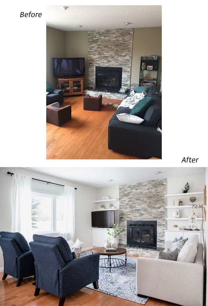
What started out as a dark, bowling alley of a room, was quickly transformed with a coat of paint, smart built ins and family-friendly furnishings. Never underestimate the power of a fresh coat of paint. Especially the right white paint. Emphasis on right. What may look amazing in a friends place, could look ashy and dull in yours depending on lighting. So always test, test, test!
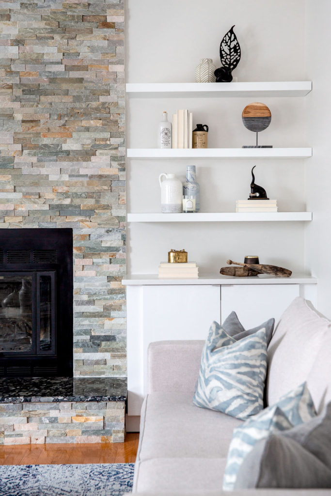
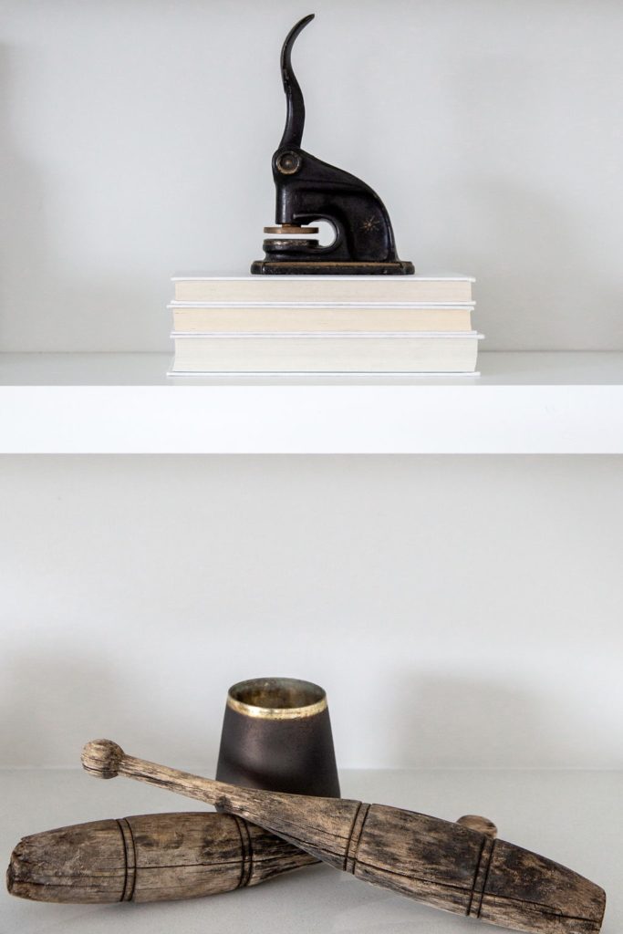
Sometimes when designing a space you luck out, in this case we absolutely did. The space on either side of the fireplace was the exact size for floating shelves from IKEA. And we were able to use IKEA upper cabinets with a stone top for some necessary closed storage. Together they look like a custom built in. The perfect spot for toys, books and anything else you want to get out of sight quickly.
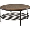
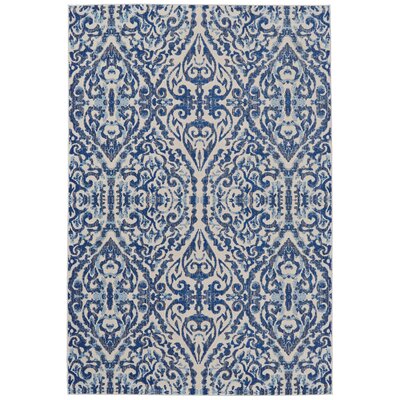
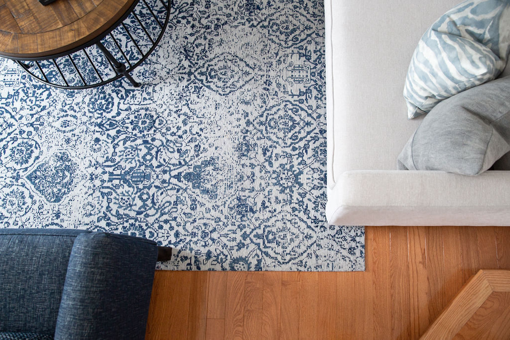
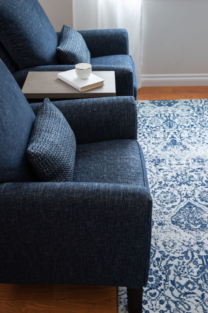
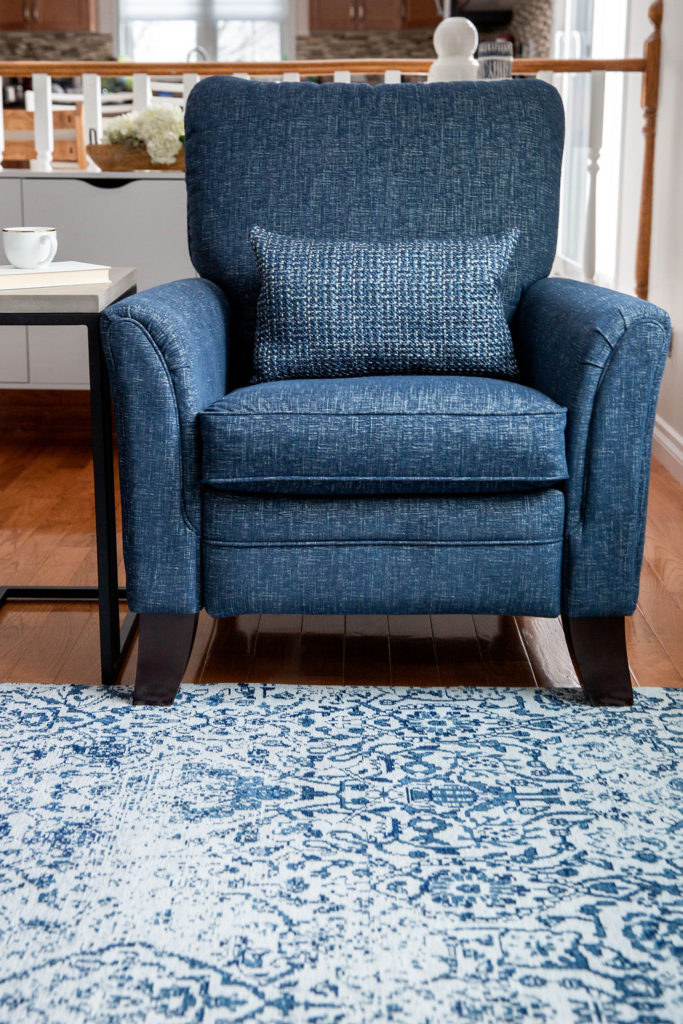
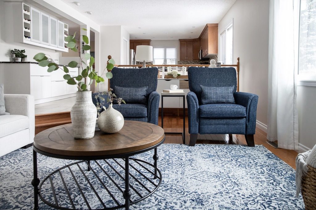
While the sunken family room feels gloriously nostalgic, the angled stairs do pose a challenge for placing furniture. I chose to position the rug width wise, to create the illusion of a wider room. Doing so also allowed the indulgent, modern recliners to fit on the rug, which helps to define the space. Sturdy, family friendly fabric in a warm grey for the sofa, a round coffee table and beautiful rug in a modern take on a traditional pattern pull the room together.
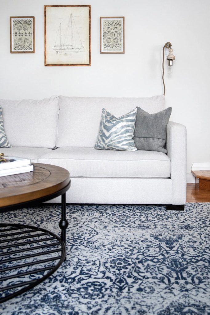
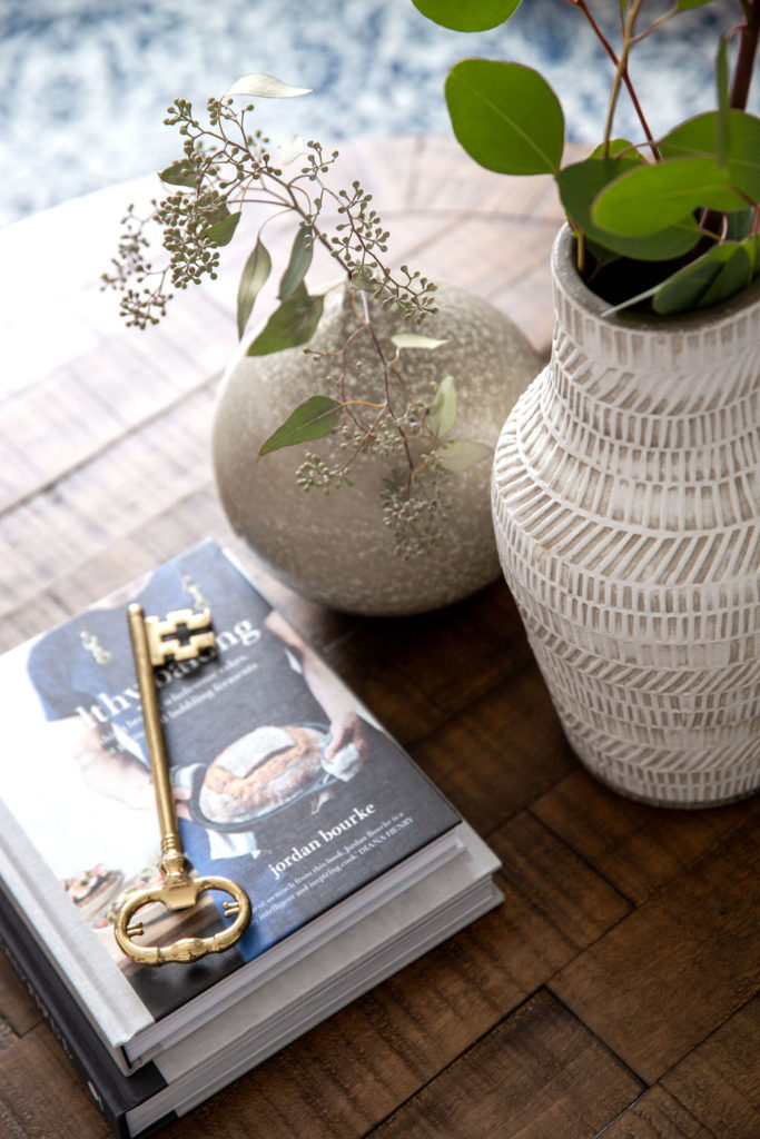
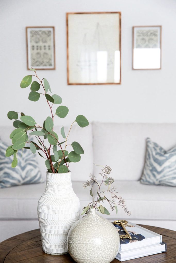
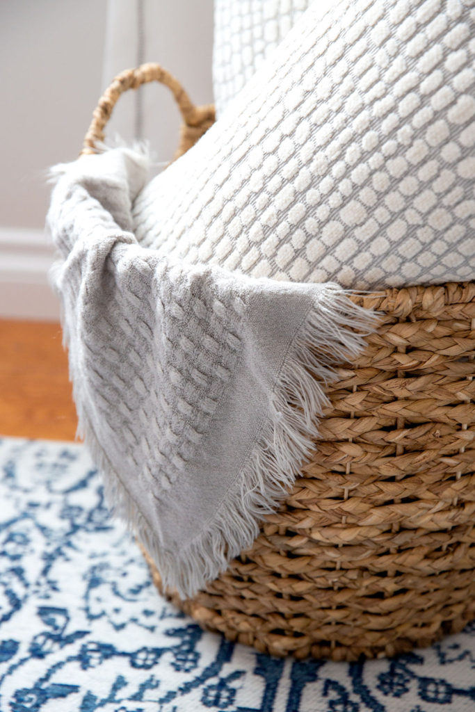
While you might want to forgo art and accessories when designing a space that is bound to be taken over by children. Done wisely, they offer personality and depth necessary to finish off a space. I chose a faux cement side table between the recliners, a woven basket for storage, and art in simple natural frames as organic elements to ground the space.
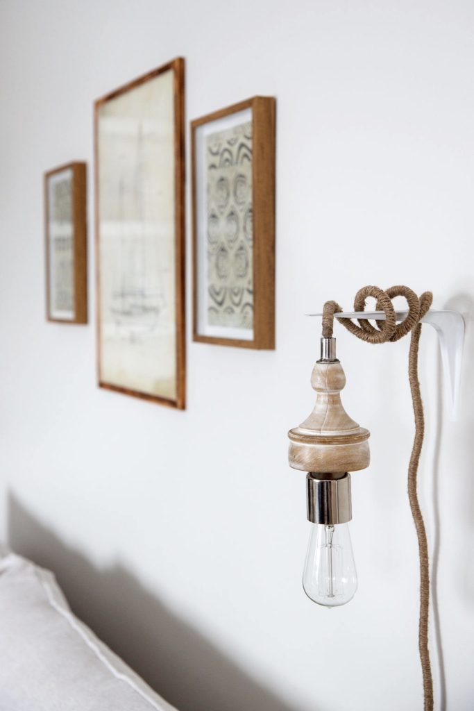
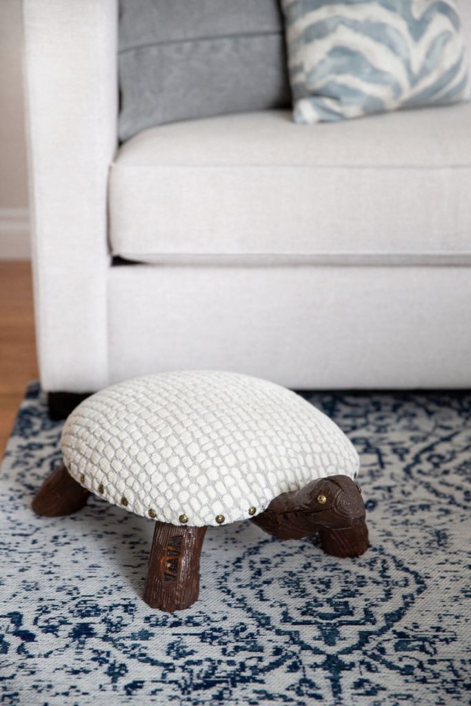
The hanging rope light fixture, while not necessarily kid friendly, adds an interesting and functional touch. And is easily removable until the kids are old enough :-) My clients grandmother had given her a pair of adorable turtle footstools. Sentimental and too cute to discard, we re-upholstered them in the perfect fabric, giving them new life. They may be my favorite part of the room!
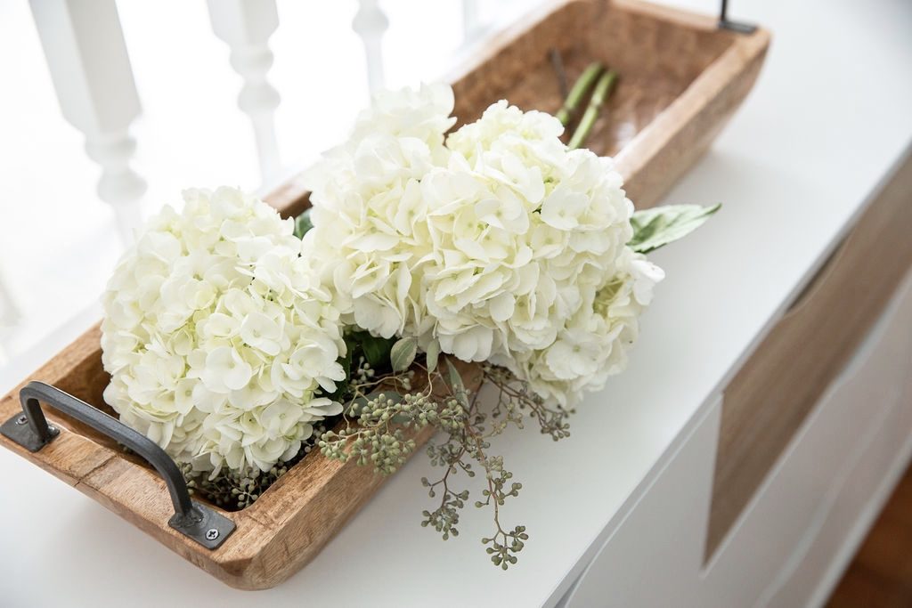
A simple side board at the back of the room offers additional storage, which with two littles one running around, is helpful! All together, I think this space accomplishes what my clients had dreamt of. A family friendly space they could be proud of, that is durable, comfortable and beautiful. Mission accomplished!
Get the Look
Design: Neelam Gurm; Photography: Lindsay Nichols Photography
