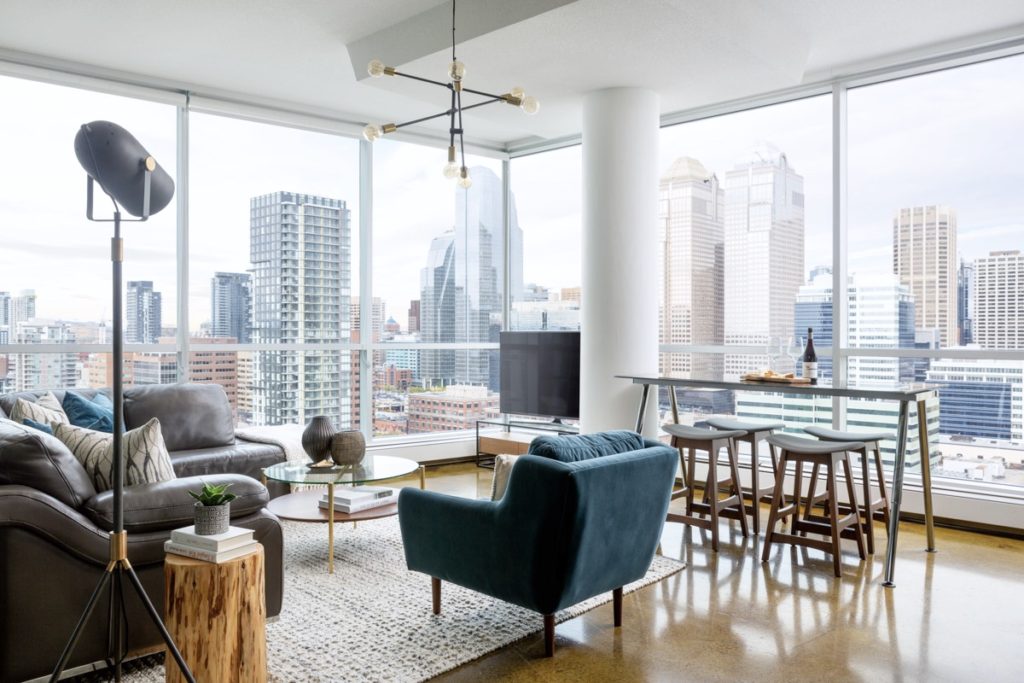
I find design clients most often reach out to me at times of transition – a new home, baby on the way, newly single, etc. Which makes perfect sense, it’s in times of personal transition and change that we can crave change in our physical environments. Which, not surprisingly, has been shown to be one of the most effective ways of successfully navigating a transition. While a move to a new home or a new city isn’t always possible, a transformation of the space you’re in is often enough to help through the transition. Out with the old, in with the new.
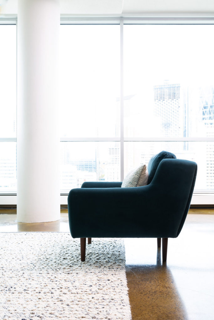
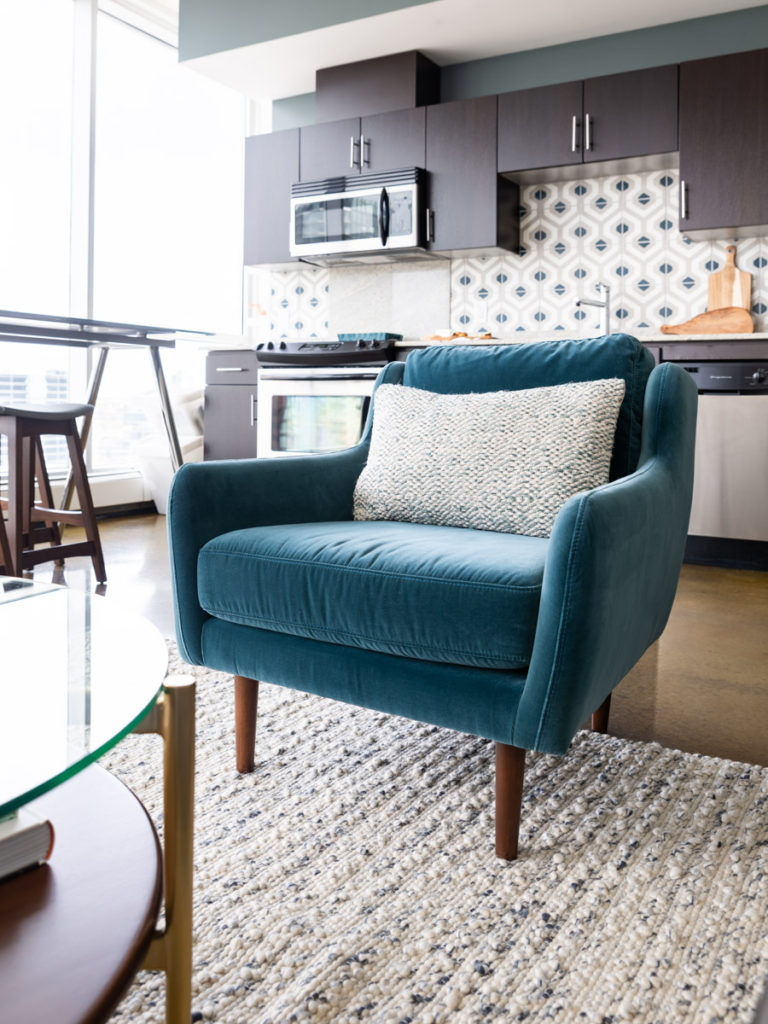
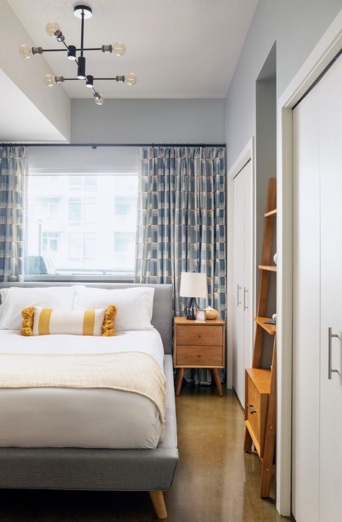
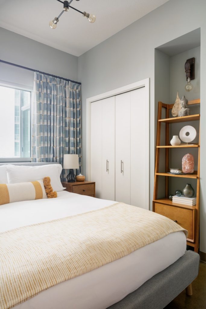
It was just a time like this in my client’s life when he called me to help give his urban bachelor pad a fresh makeover. This project was a dream from the beginning – a beautiful space, with a stunning view and an easy going client who trusted me implicitly. It was also a project of firsts – first time designing for a man, first time exploring the world of modern mid-century design and the first time tackling a cement backsplash.
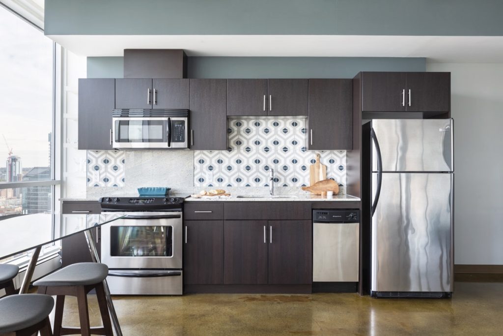
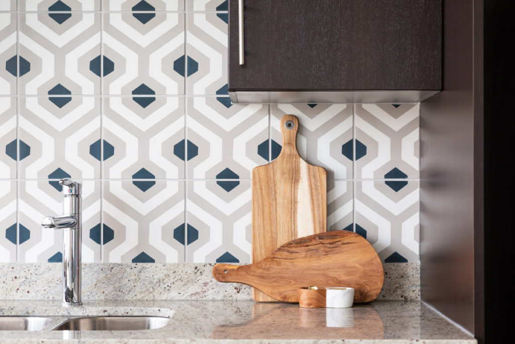
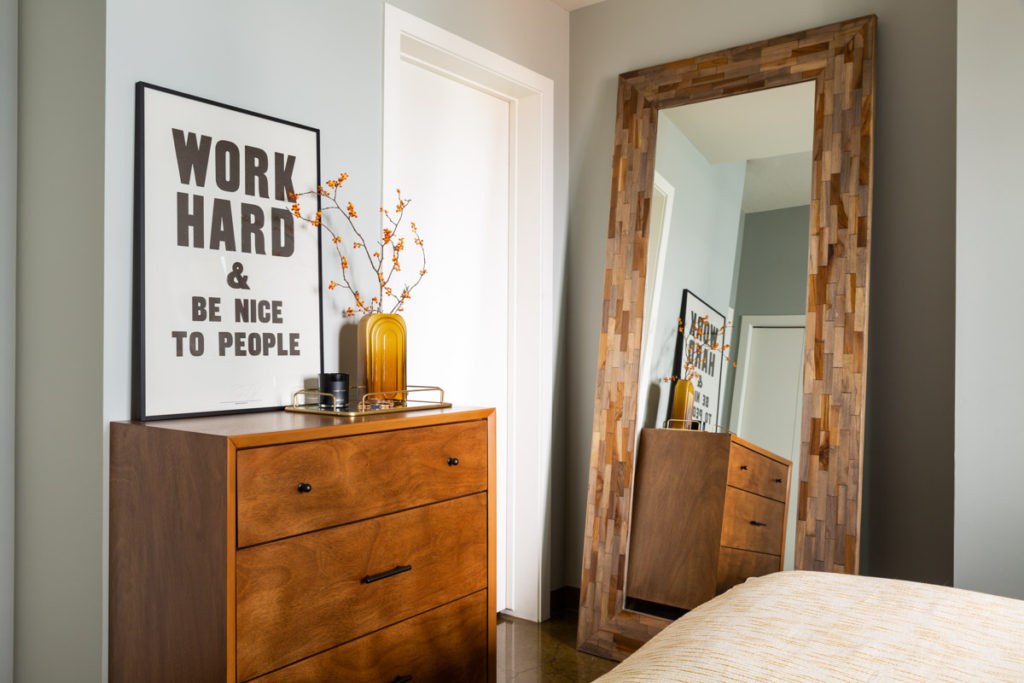
While my design esthetic is decidedly more traditional, it was fun to play with bold colour, fun patterns and mid-century lines. A quick study of the modern mid-century esthetic, characterized by clean curved lines, minimalism and functionality reigning supreme explains why so many men are drawn to it.
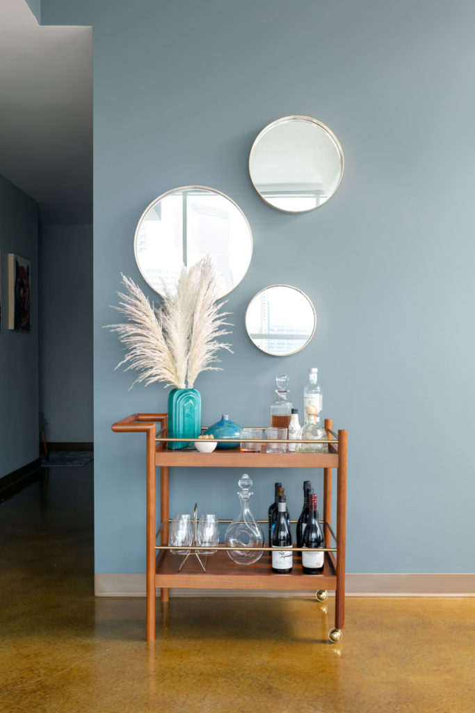
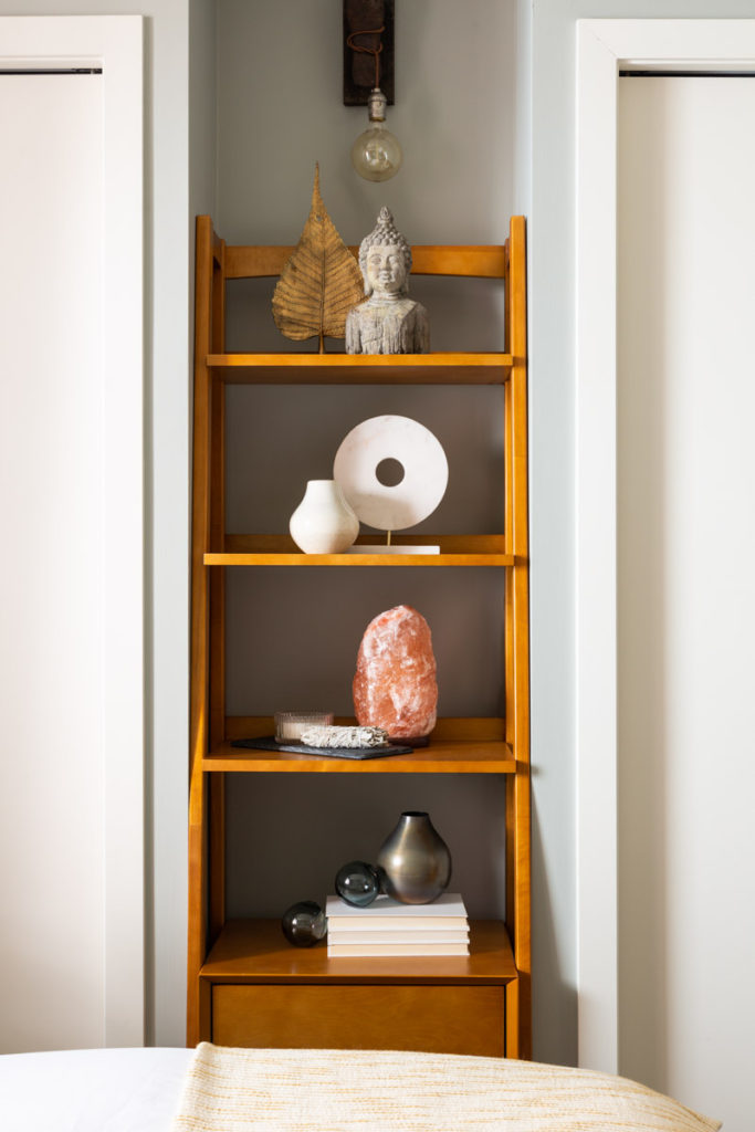
To keep the space from feeling overly modern and sterile, I wove in texture and natural elements. The knotty rug, textured pillows, tree stump table and stone accents give the space depth and warmth.
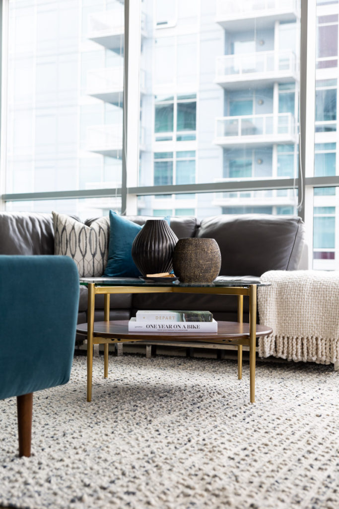
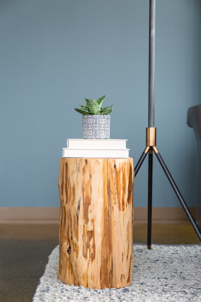
Quiet different from the spaces I normally share, I’d love to know what you think.
Design: Neelam Gurm; Photography: Klassen Photography