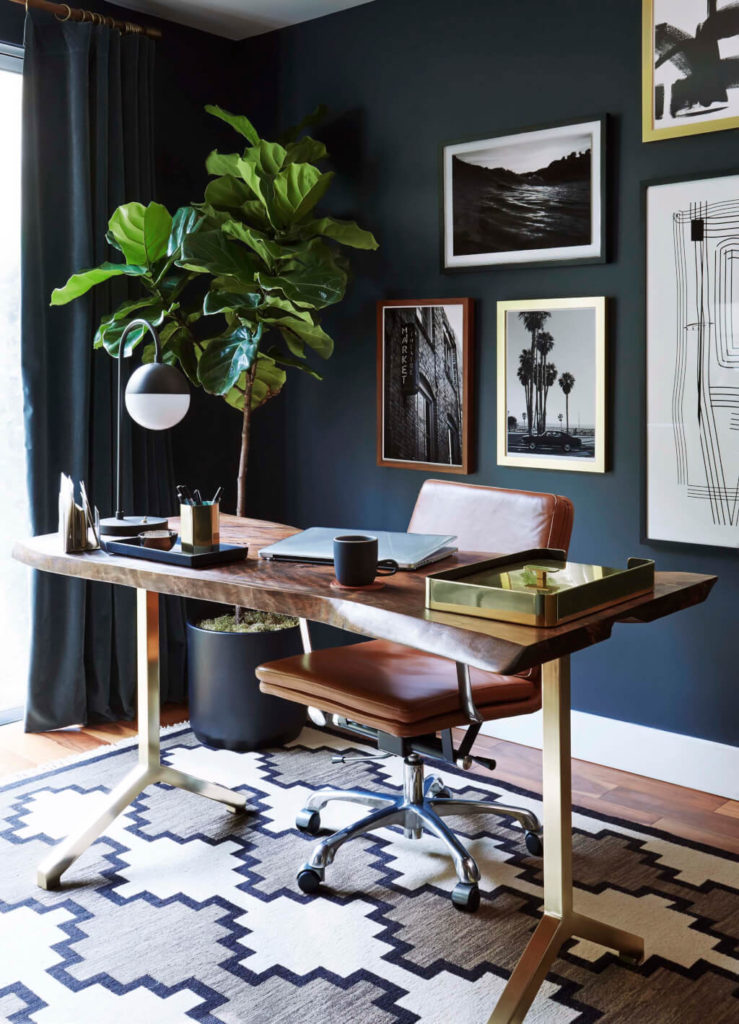
There’s no question I like a white and bright space. Nothing offers a better backdrop for design. But sometimes, a saturated colour is just the thing to add some wow and interest to a space. In those instances, there are few tried and true colours I turn to, my favourite saturated paint colours.
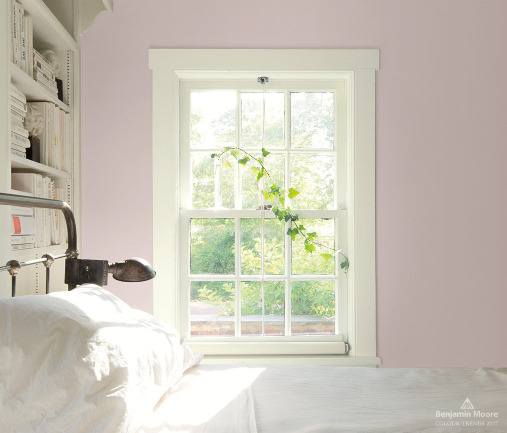
Porcelain by Benjamin Moore is the perfect adult appropriate pink. Undertones of purple and grey keep it from feeling juvenile or venturing into baby pink territory. I think an office would be lovely in this.
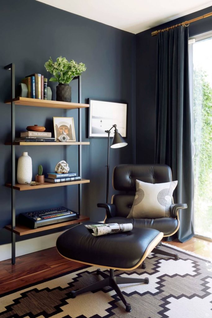
Blue Note by Benjamin Moore is the ultimate in dark and moody sophistication. If you want drama, this is your colour. I especially love it in this office, you know, if you’re not into pink ;-)
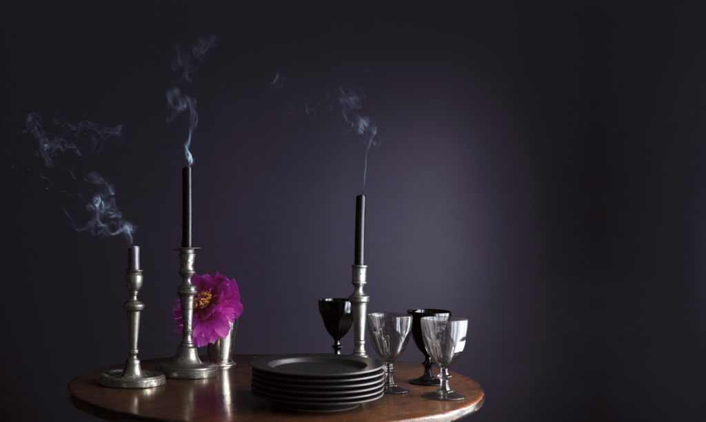
Shadow by Benjamin Moore is the perfect saturated violet. Regal, bold and beautiful. Perfect for a dining room.
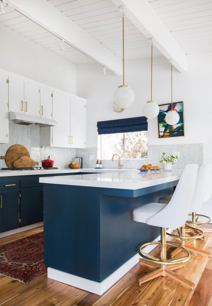
Hague Blue by Farrow & Ball is the navy. Rich, with just the right amount of purple and green, it’s perfect for bight, open areas like this kitchen.
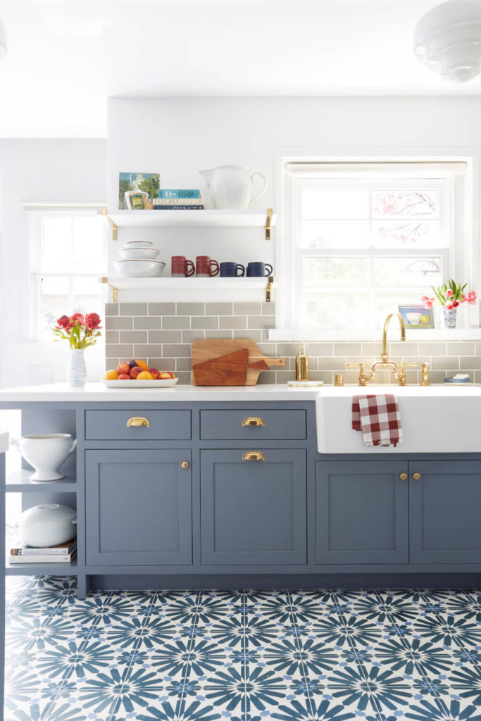
Wolf Grey by Benjamin Moore is the perfect slate blue. Clearly I love the blue family when it comes to saturated paint colours :-) This one in particular is just light enough without falling flat. Perfect for cabinetry.
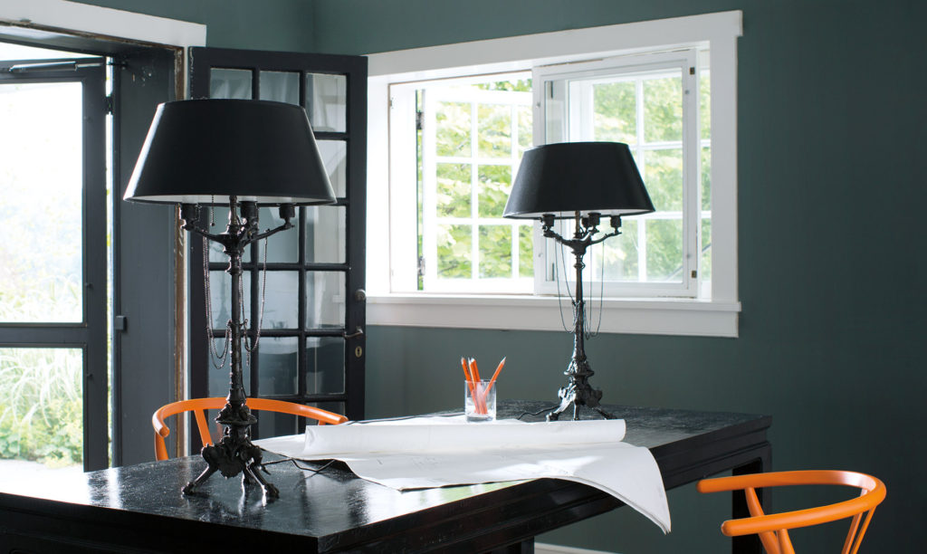
Knoxville Gray by Benjamin Moore is my favourite bluey-green (yes, I know, blue again!), subtler and more approachable than forest green, it’s great for an office or dining room.
So, which ones are your favorites? Are there others you would include? I’d love to know!
Images